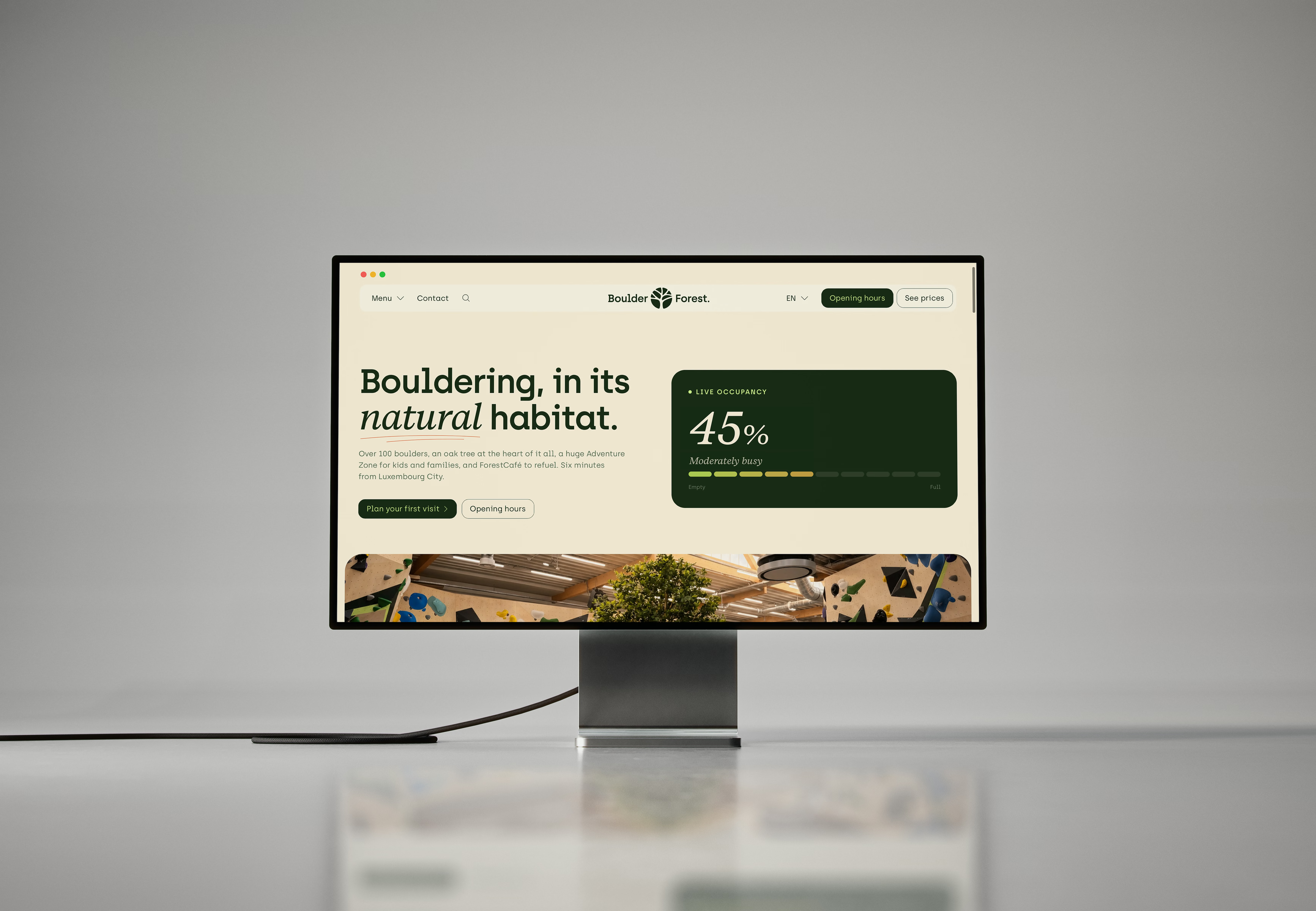
Bringing the forest indoors: branding for Luxembourg’s new bouldering gym.
It started with a phone call one morning. Gilles, managing director of what would become BoulderForest, asked whether I'd like to design the brand for a new bouldering gym. I've been climbing for years. It was an easy yes.
At that point almost nothing was certain. There was a working name and the chance of a hall near Luxembourg City, and very little else: no site, no floor plan, no opening date.
So the brand had to be ready to grow with the project, from a single logo to a building people would one day walk through.
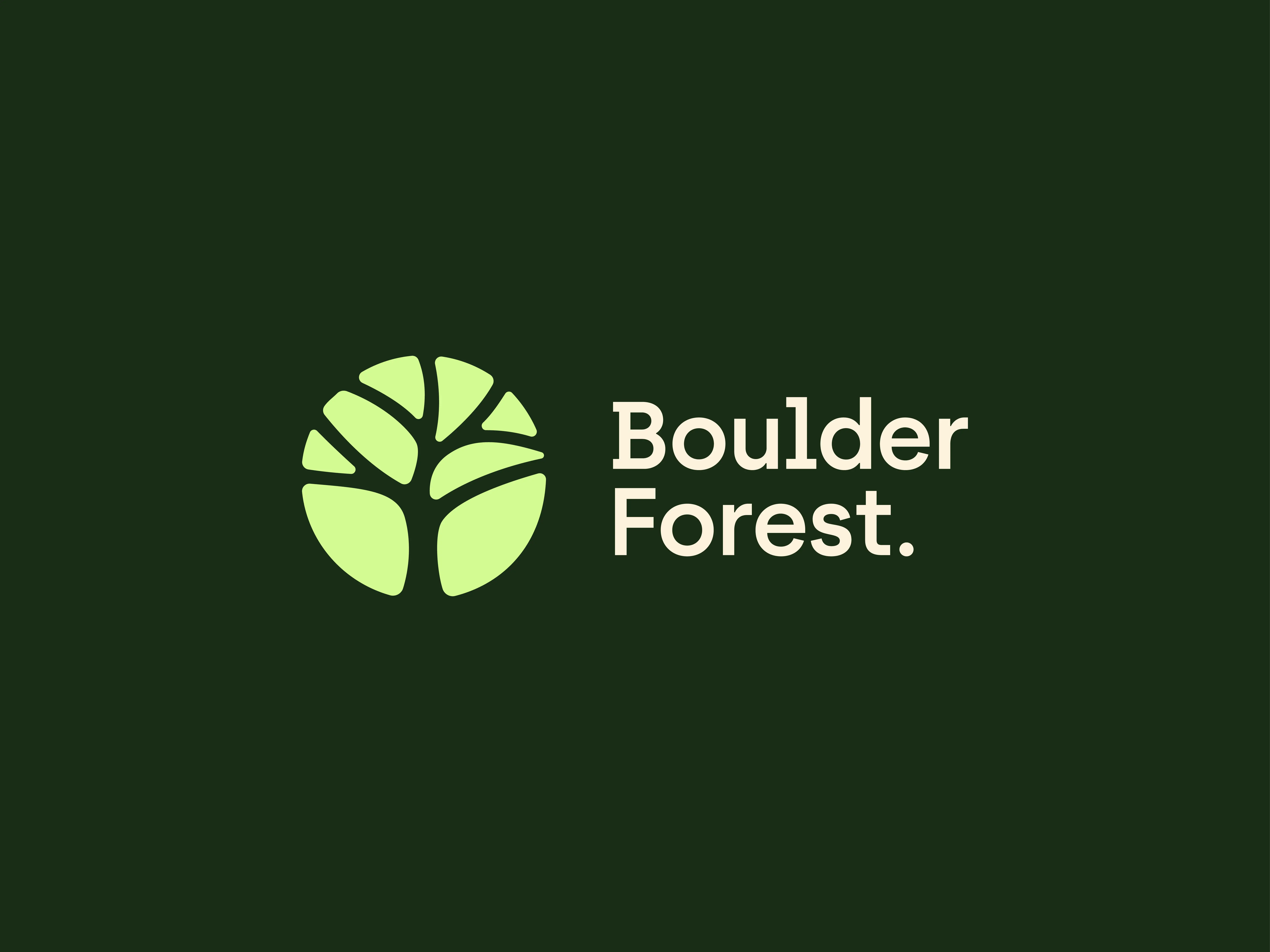
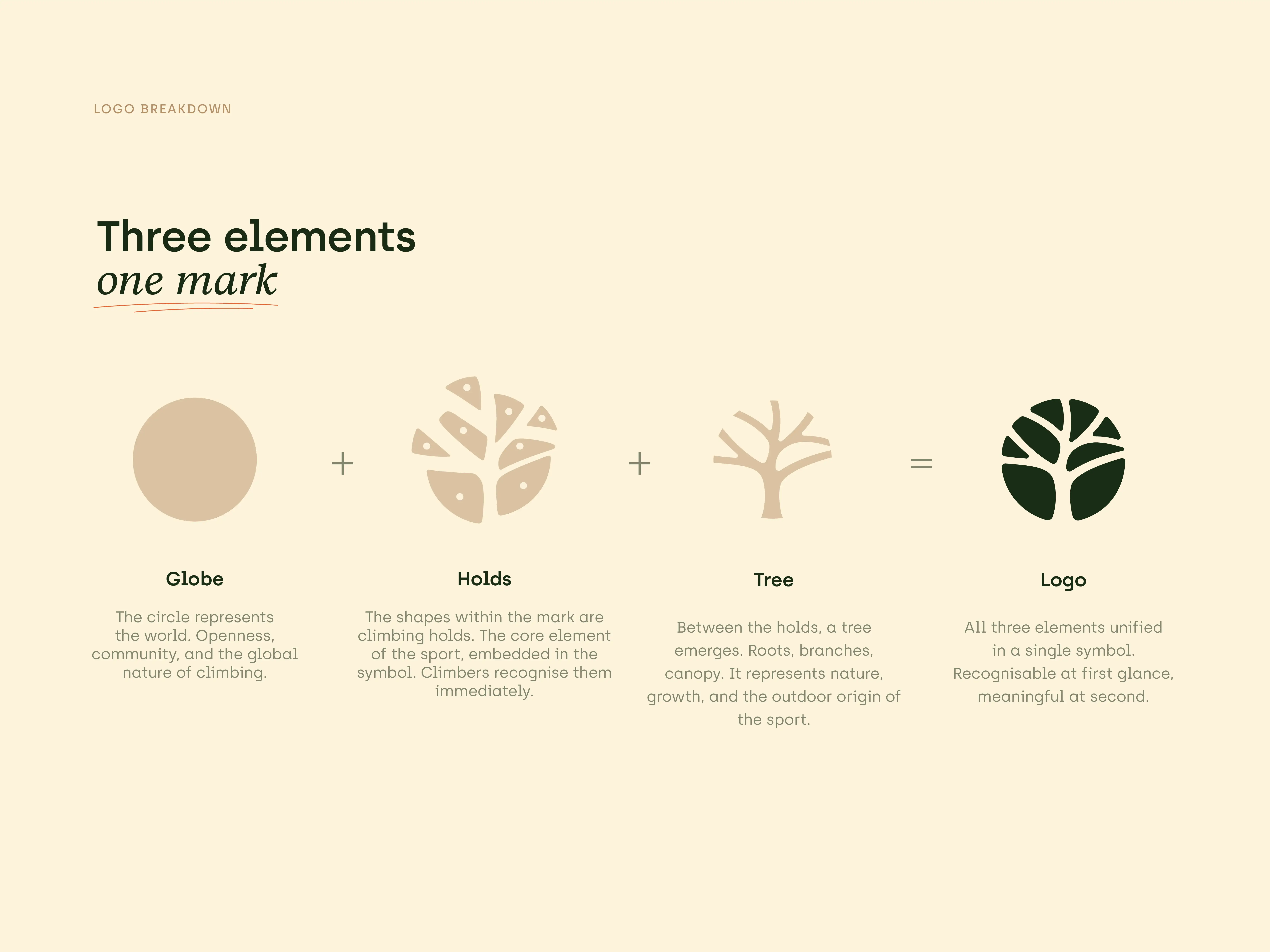
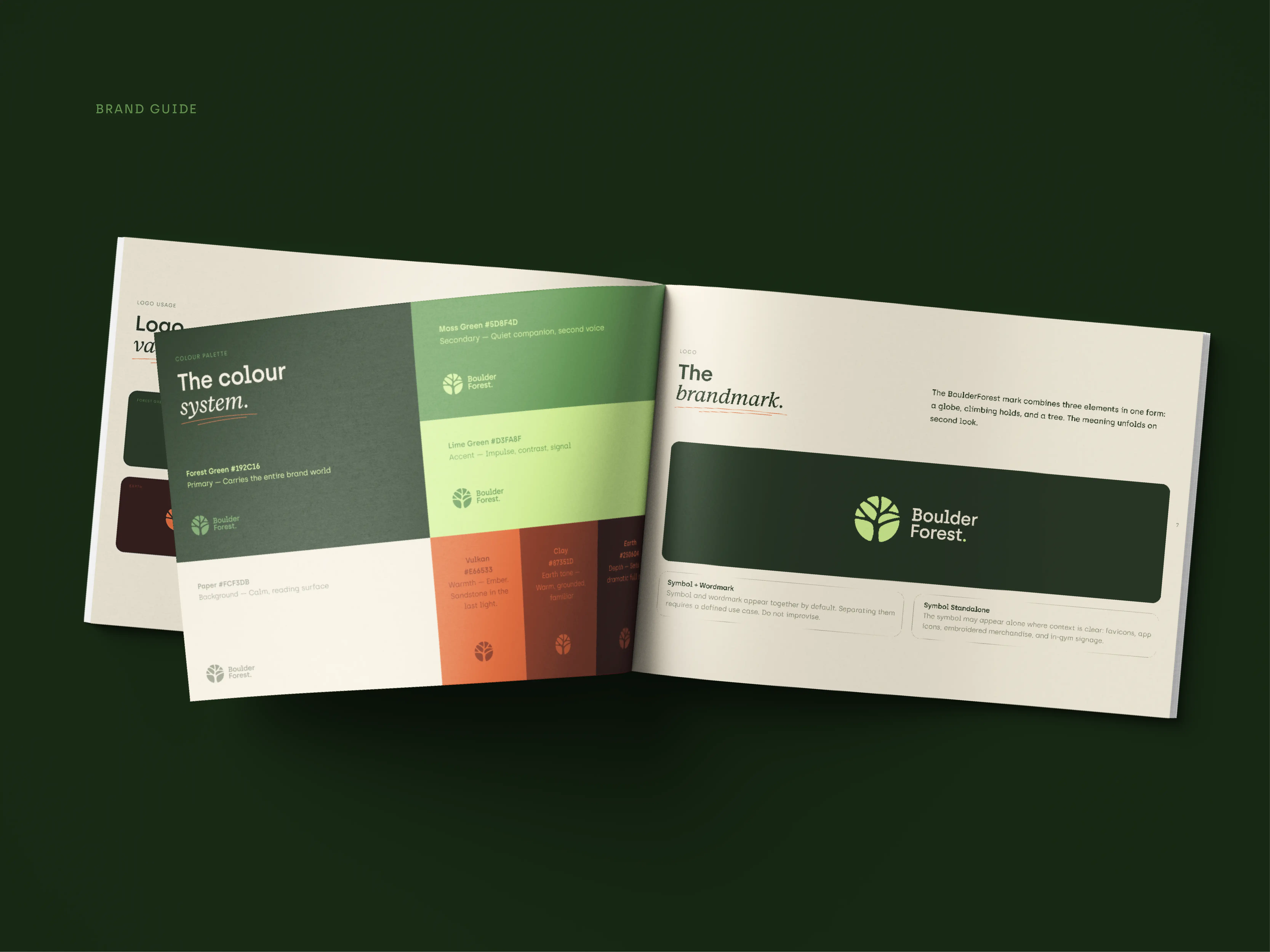
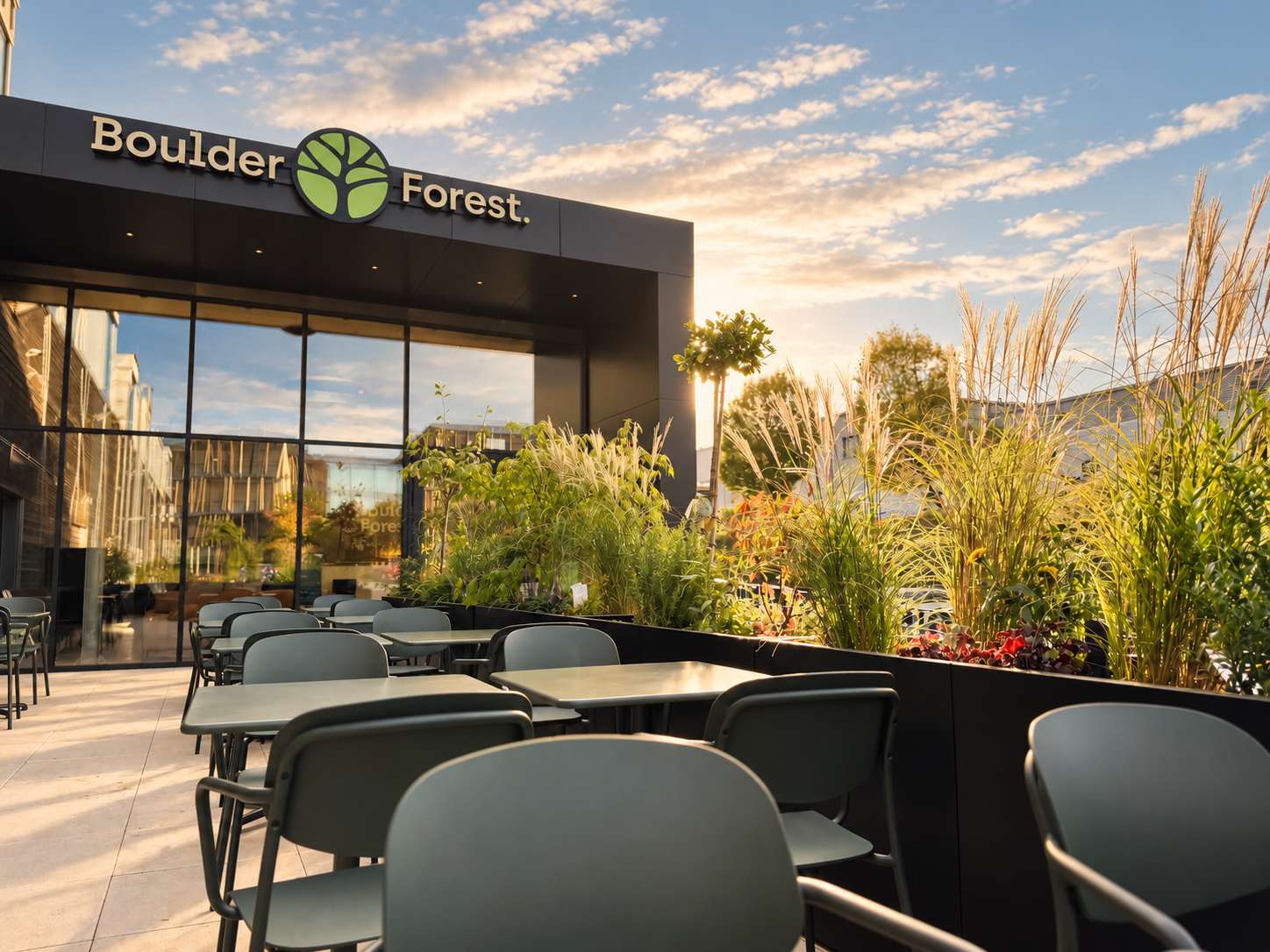
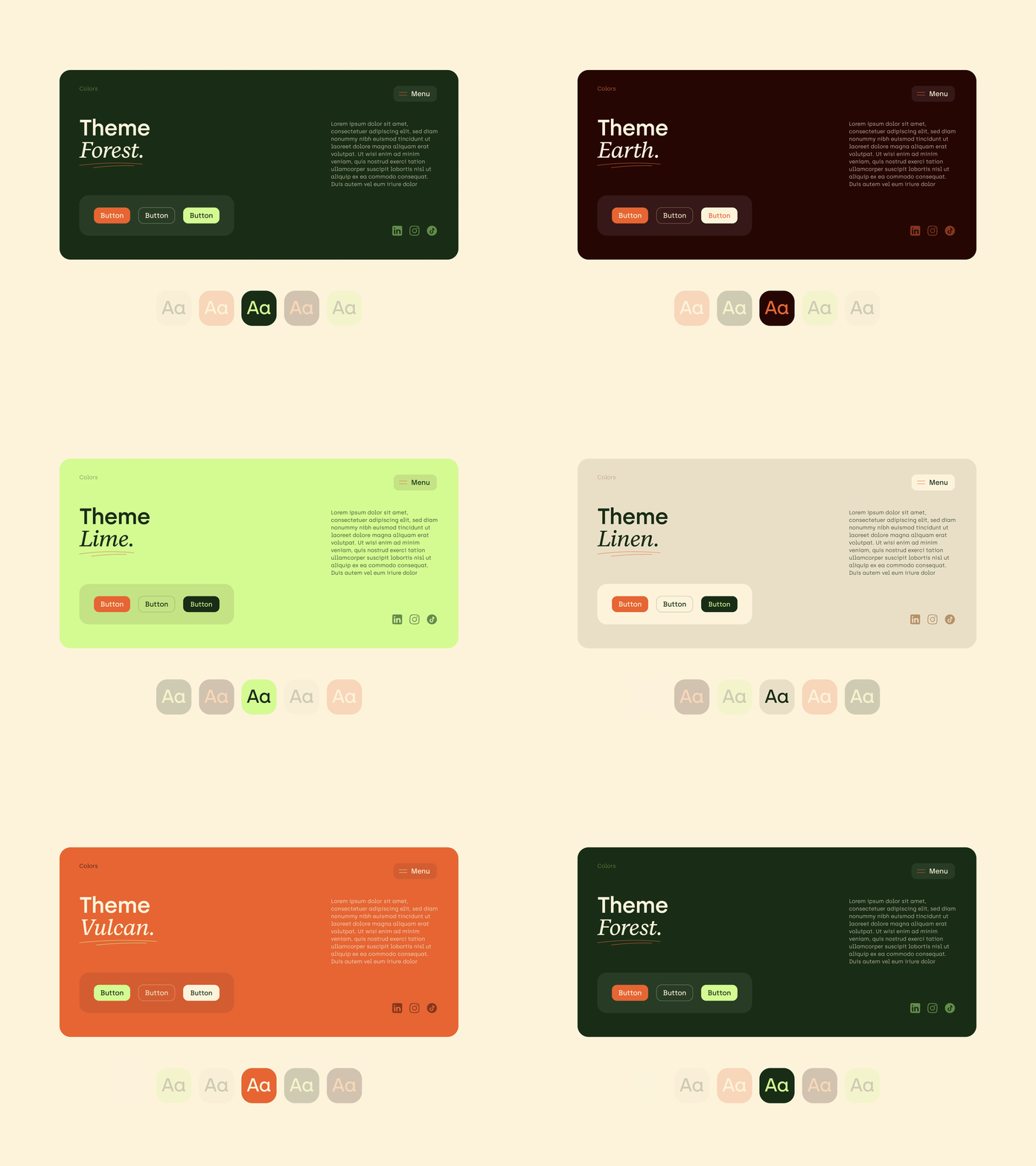
Over the following weeks and months I drew the logo, built the colour system and chose the typefaces. It took a lot of back and forth, and somewhere along the way BoulderForest took shape: a name and a look that finally matched the feeling of climbing indoors with the outdoors still in it.
Once the brand stood, it left the screen. I worked out the colours of the walls and zones with the wall builders at BLOCZ and the architect, so one thread runs from the logo all the way to the walls you climb.
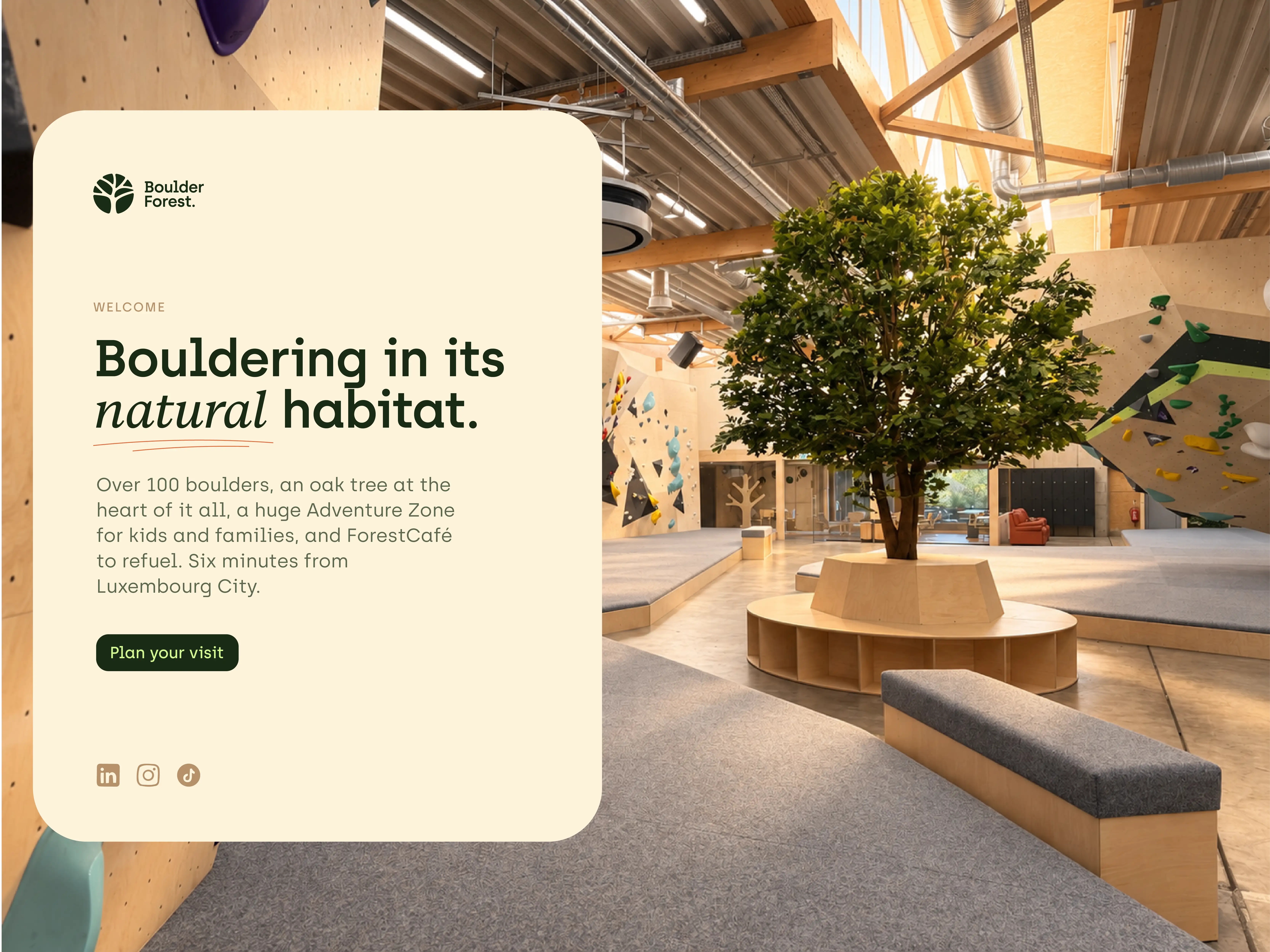
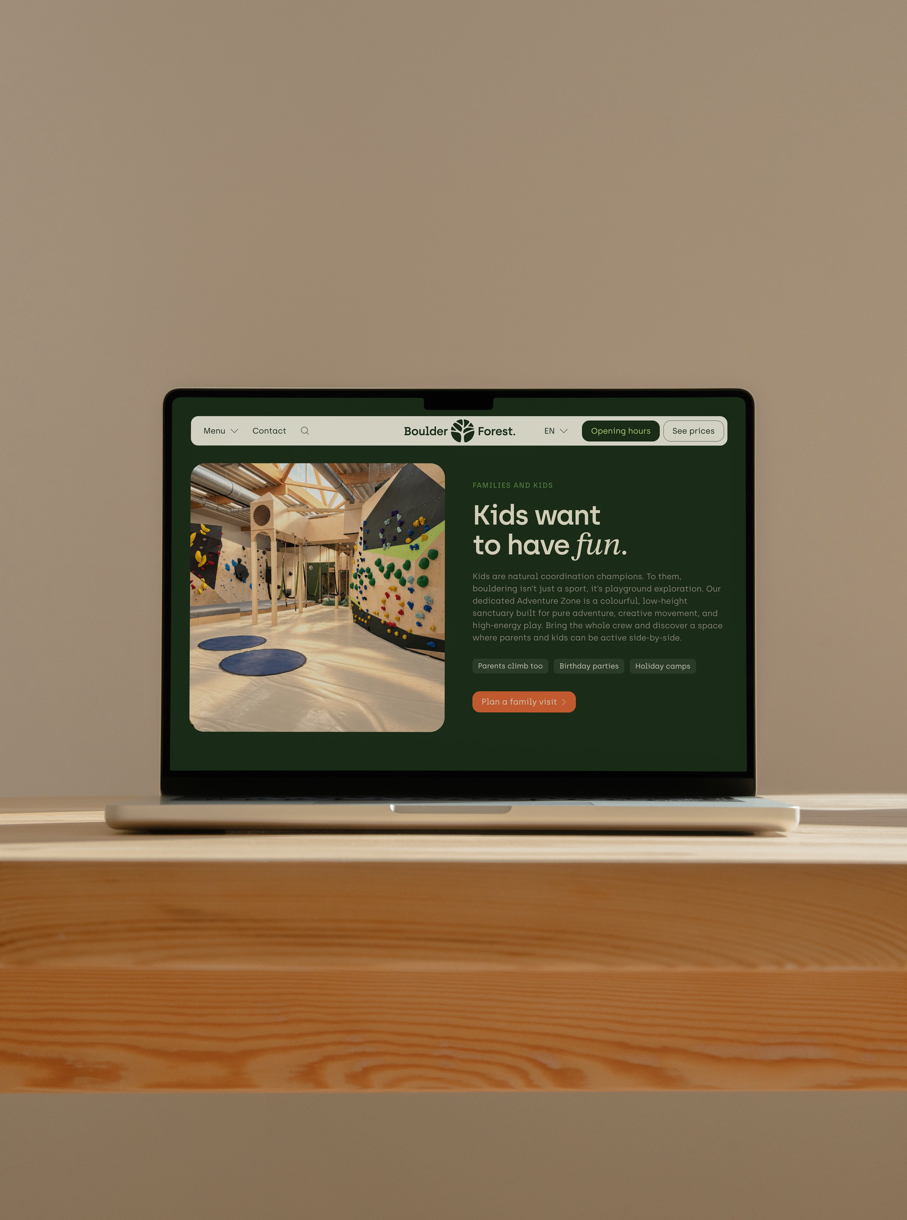
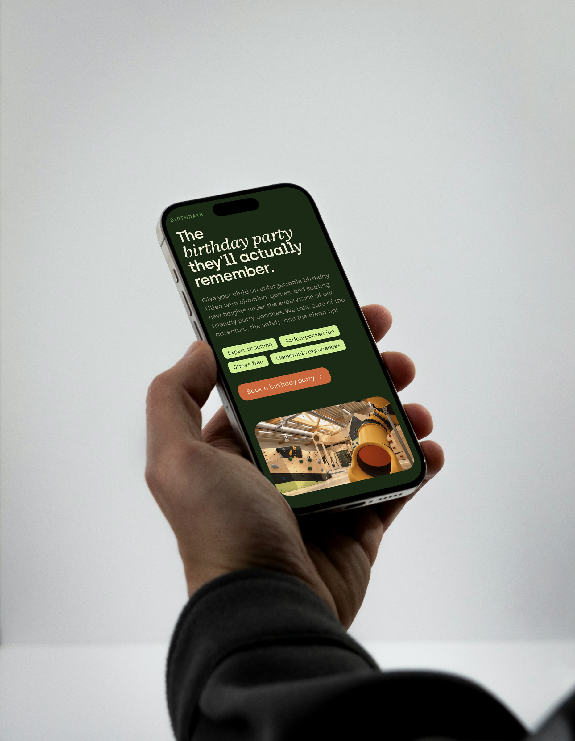
On the surface, the website had one job: carry the charm and outdoor warmth of the brand online. Underneath, it does a lot on its own. A live busy meter shows how full the hall is right now. The course page is connected to the booking database and updates itself. Opening hours know about holidays and special days.
Everything else the team runs through the CMS, without writing a line of code.
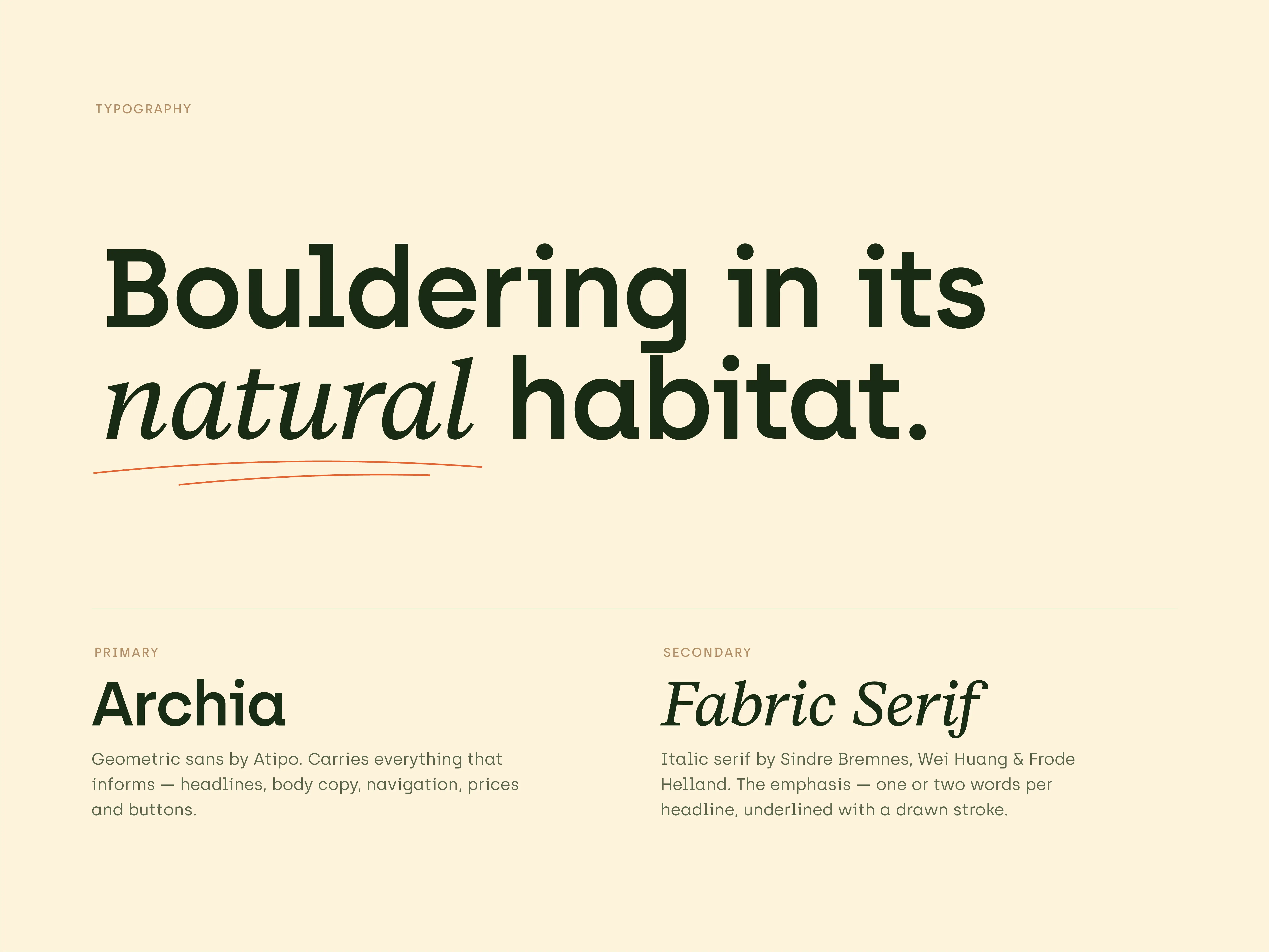
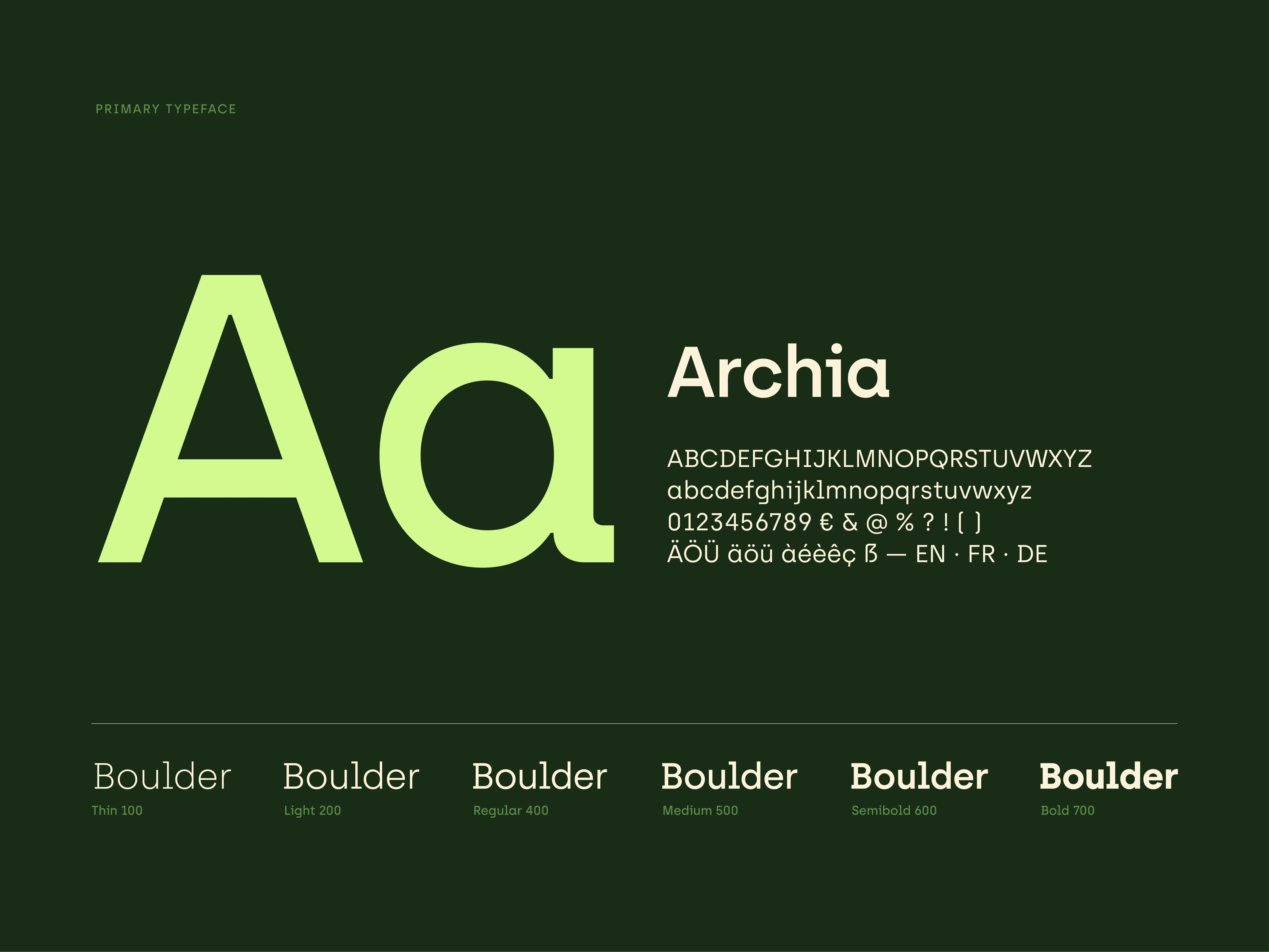
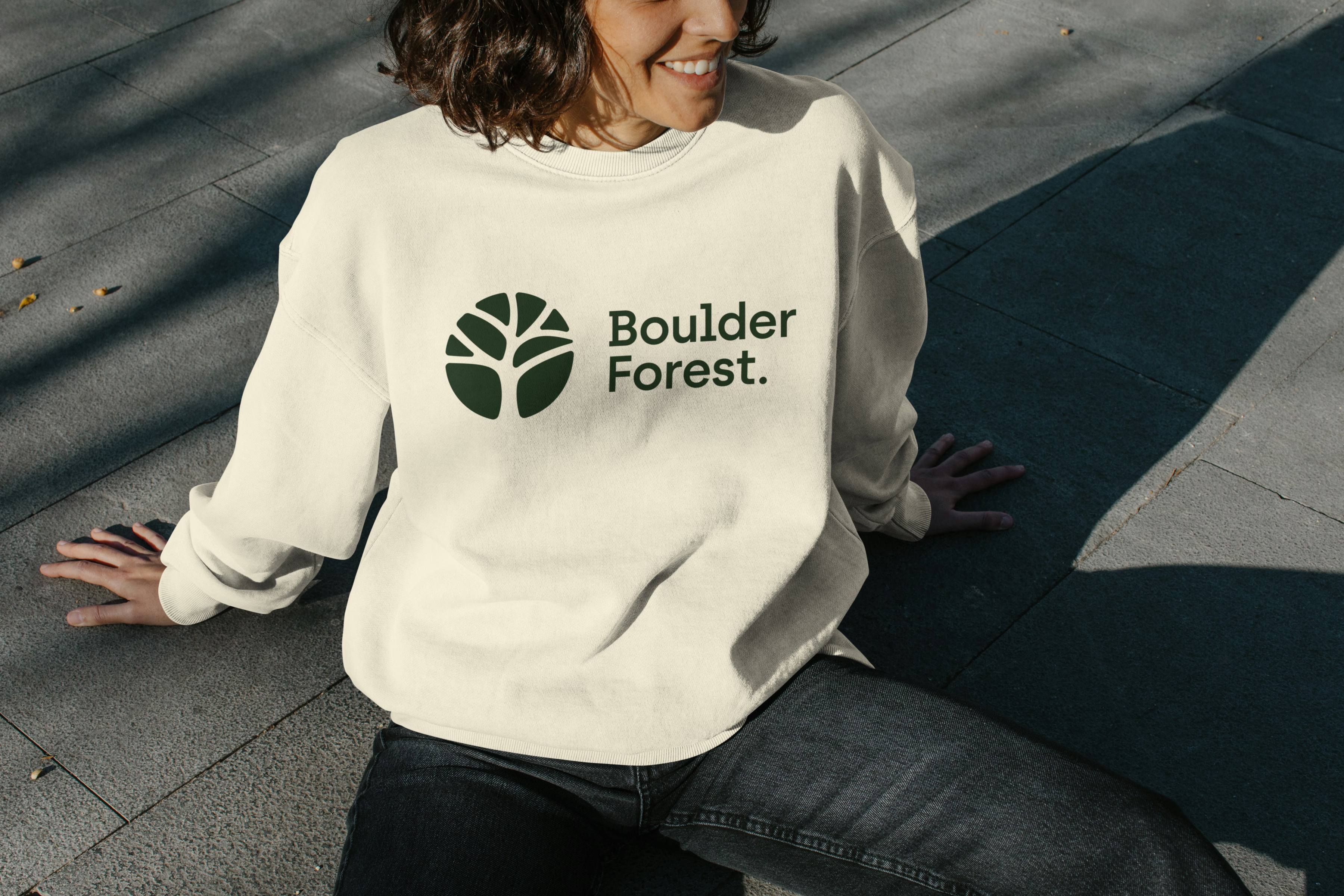
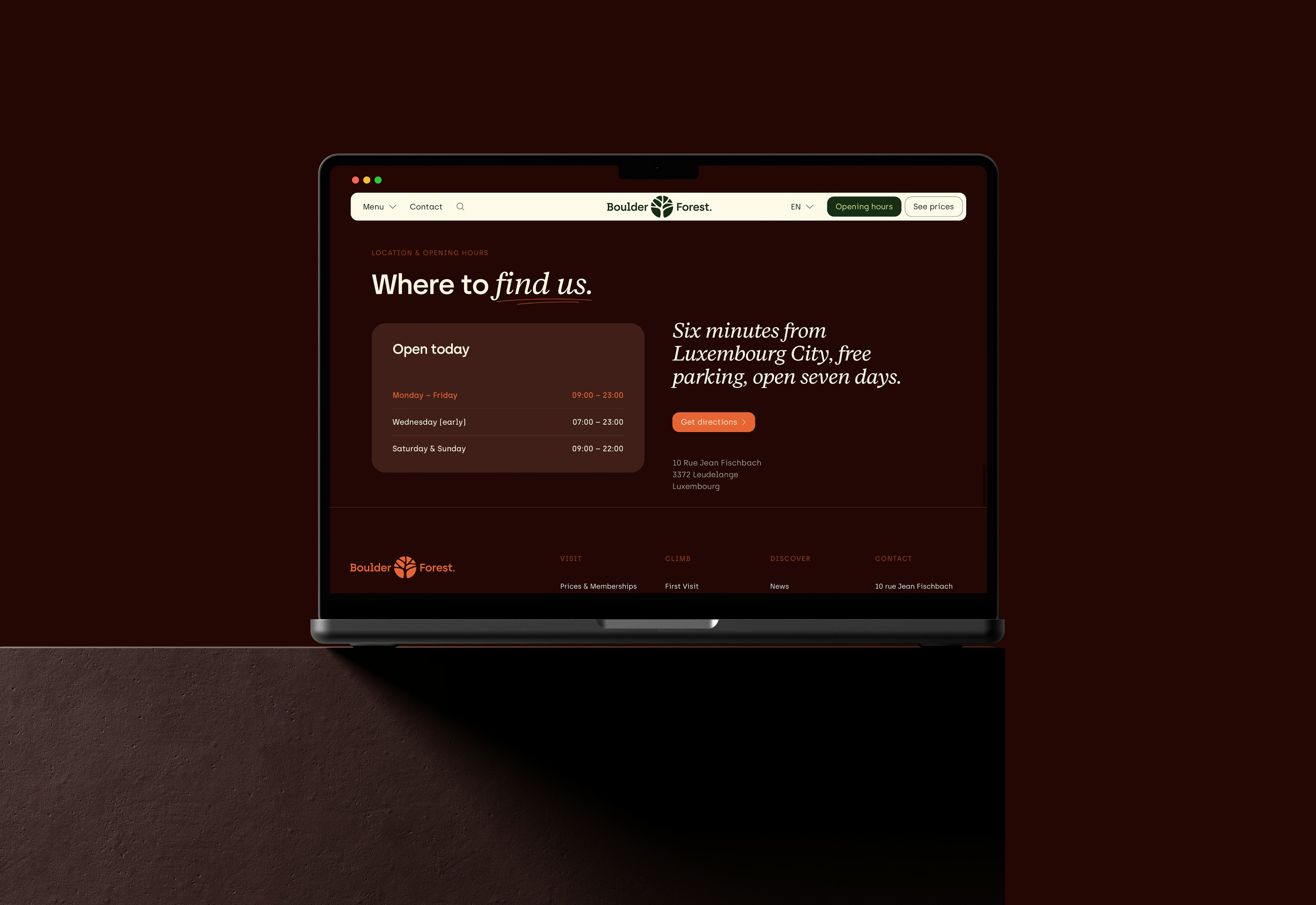
BoulderForest opened in September 2026 with its own visual voice: on the website, the membership cards, the hall map, the rules posters, the icons, the signage and the wearables. What began as a phone call about a logo became a brand you can climb.
Curious what we could create together?
Tell me what you are working on.

.webp)
Spuerkeess
A visual language that makes financial stories human