
Making the energy transition visible
Living Lab is Creos’ research project for the electricity grid of tomorrow. For a full year, 14 households in Cruchten, Luxembourg, used electric cars, heat pumps, solar panels and home batteries while Creos measured how the local grid responded.
The design challenge was just as interesting as the research itself: how do you make complex energy systems understandable without oversimplifying the science?
Creos needed more than a logo. It needed a visual language that could work at the kitchen table and still hold up in a technical report.
I started with the identity, building on Creos’ signature blue with lighter and darker shades and a fresh lime green. From there, the project grew into a whole world of isometric illustrations, icons, infographics and publications.


A world on an isometric grid
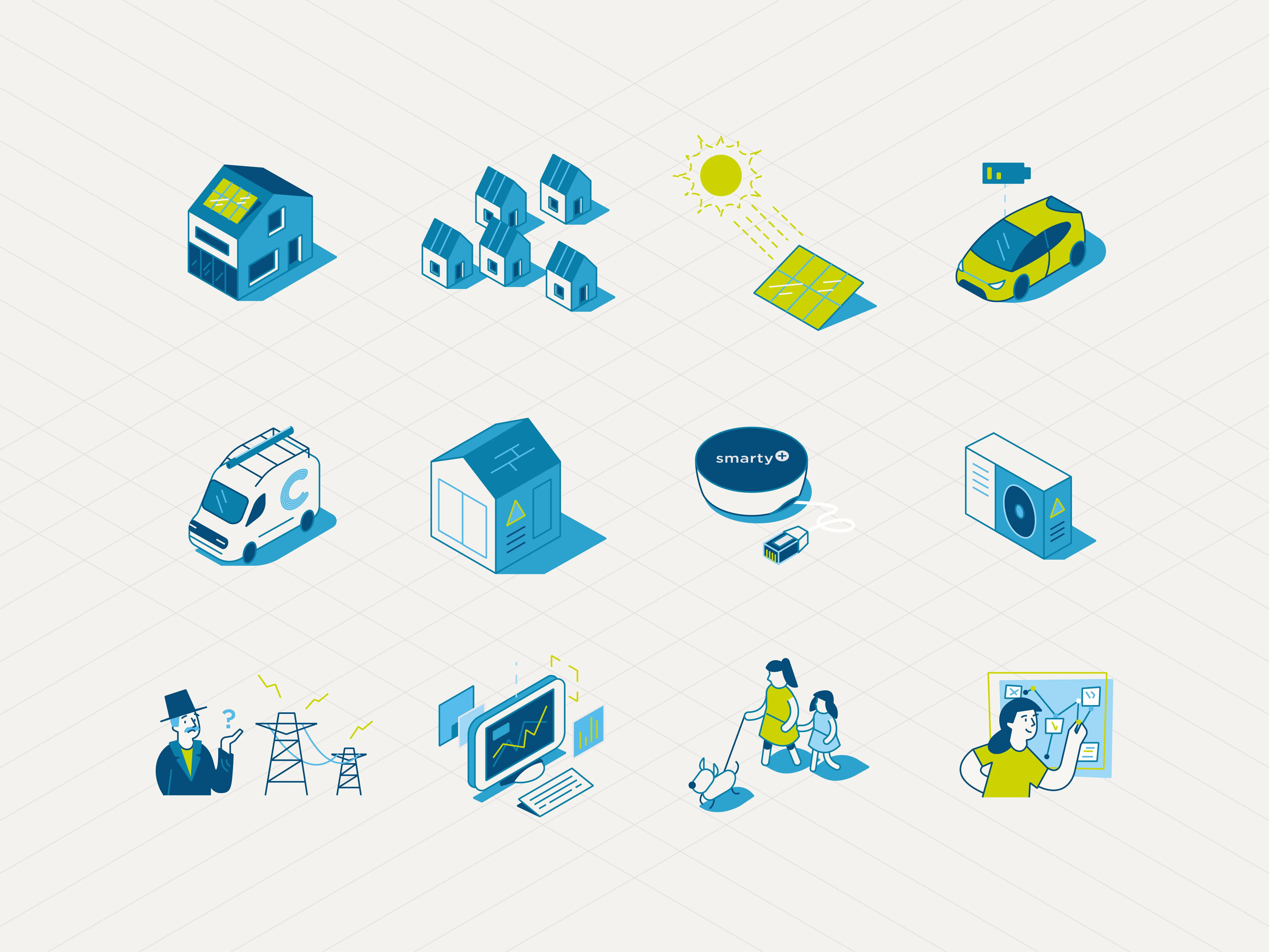
At the heart of the identity is a modular library of isometric illustrations and icons.
From houses and electric vehicles to solar panels, batteries and everyday objects, each element follows the same perspective, proportions and visual style.
Designed as a flexible toolkit, the illustrations can stand alone, support written content or come together to form larger scenes. This creates a consistent visual language that makes technical subjects easier to illustrate and gives Creos a growing library of reusable assets.


Turning complex data into clear stories
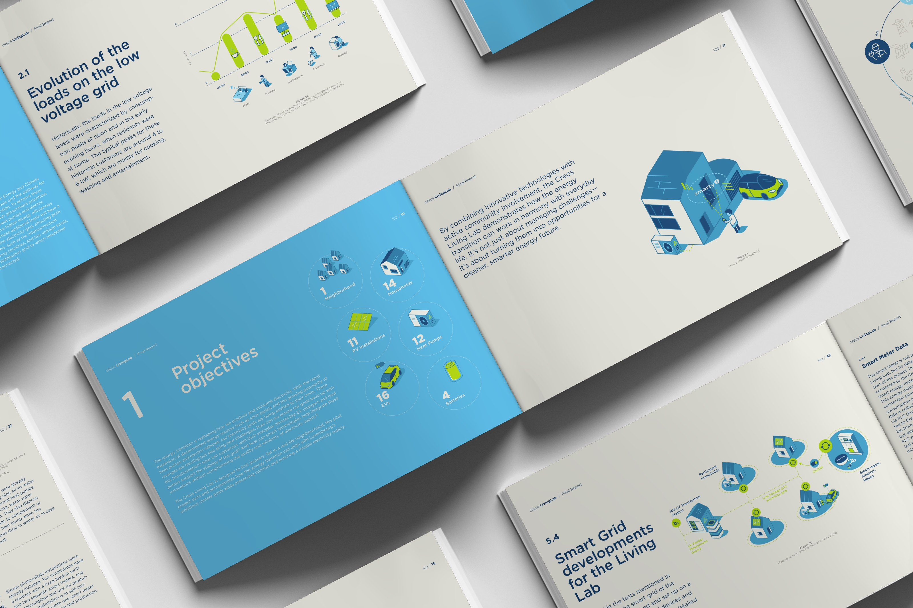
The visual identity extends into two publications documenting the Living Lab’s experiments, measurements and findings: the Mid-term Report and the Final Report, spanning more than 100 pages.
More than 50 graphs and charts were redesigned to fit the visual language, accompanied by custom infographics, isometric illustrations and a carefully structured editorial layout.
The aim was to bring clarity to a large amount of technical information, creating reports that are engaging to explore while remaining accurate and professional.

From the first logo sketches to the final pages of the reports, Creos Living Lab developed into a cohesive visual system.
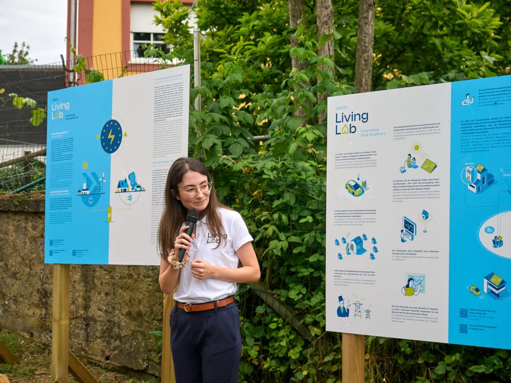
The identity brings together branding, illustrations, infographics and editorial design across a wide range of applications, including vehicles, information panels, calendars and publications.
The result is more than a recognisable look. It’s a flexible visual language that helps Creos communicate complex ideas, connect with different audiences and make the energy transition a little easier to understand.
Curious what we could create together?
Tell me what you are working on.





Spuerkeess
Illustrations that make financial stories human