Spuerkeess
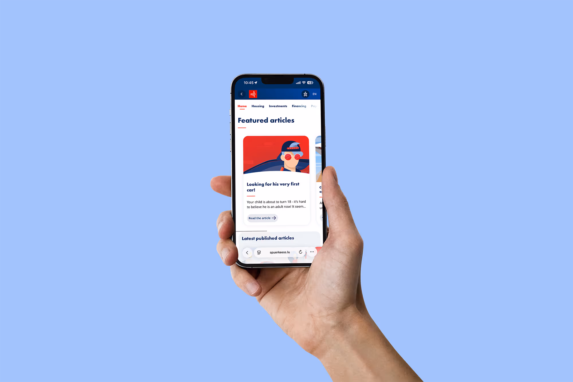
Spuerkeess commissioned Kaiwa Studio to build a visual language for its blog—one that makes financial topics easier to approach, without talking down to the reader.
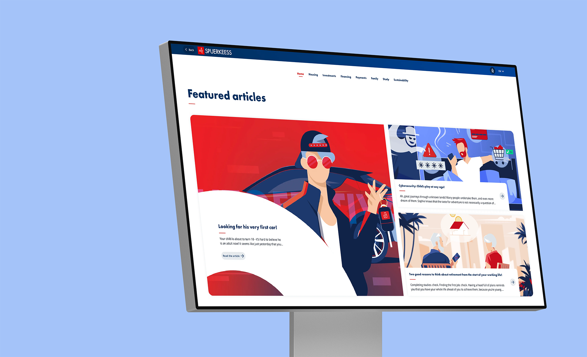
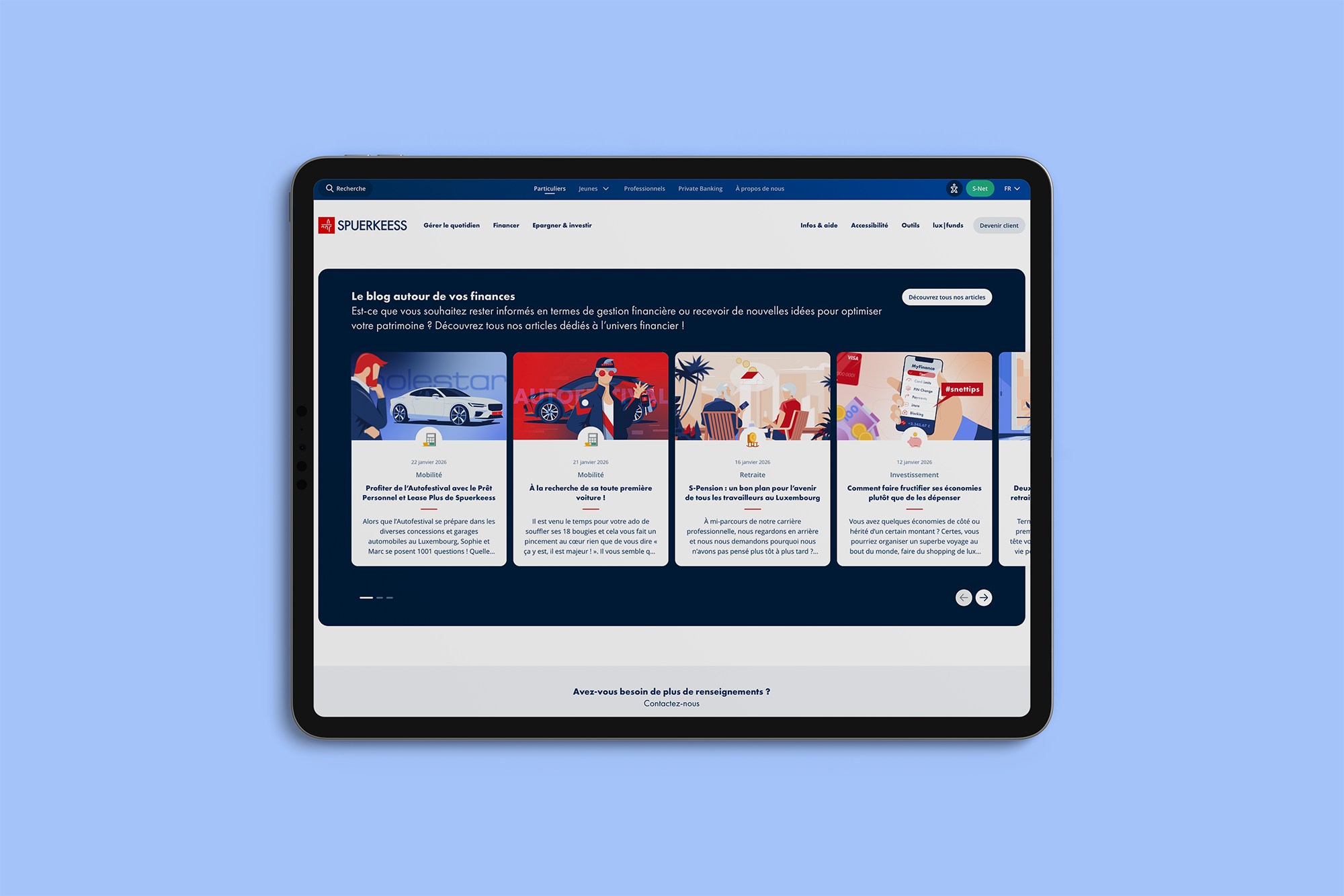
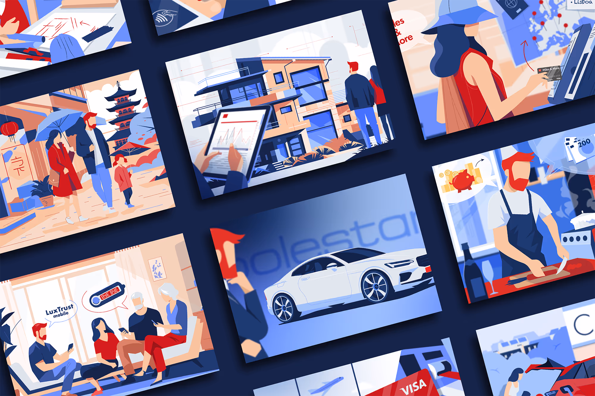
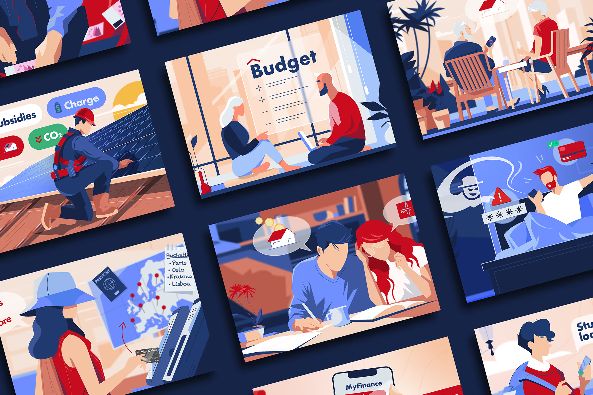
The goal was simple: give each article a clear visual entry point and a consistent editorial feel. The illustrations were designed as companions to the content, helping readers navigate themes such as personal finance, investing, mobility, sustainability, and everyday decision-making. Instead of generic “finance icons,” the work focuses on relatable moments, clear metaphors, and strong compositions—so the topic feels human, not abstract.
Over time, the collaboration developed into a broad illustration system. More than 300 illustrations, portraits, and infographics were created, forming a cohesive archive that can grow with new themes and new formats. The style balances clarity and character: simplified shapes, a controlled palette, and deliberate use of color for emphasis—while keeping the overall look calm, structured, and editorial.
The result is a flexible, recognizable illustration world that strengthens the blog’s identity and supports long-term publishing—helping Spuerkeess communicate complex subjects in a clear, friendly, and visually engaging way.

Each illustration begins with hand-drawn sketches. This early phase is used to explore ideas, test compositions, and define the visual narrative. The focus is on structure, framing, and clarity rather than detail or style.
Different approaches are sketched and refined until the composition feels balanced and the scene reads clearly. Solving the image at this stage ensures a strong foundation before moving into digital work.


Once the composition is set, the drawing is redrawn digitally using a graphic tablet. This step focuses on refining shapes, adjusting proportions, and clarifying details while staying true to the original sketch.
Color is then introduced with restraint, guided by contrast, hierarchy, and rhythm. Elements are simplified or adjusted where needed, ensuring the final illustration feels clear, balanced, and consistent within the overall visual system.


Other projects

Beyond function: an art-driven Climbing Guide
A vibrant identity inspired by creativity in motion
.webp)
A Visual Language for Financial Stories