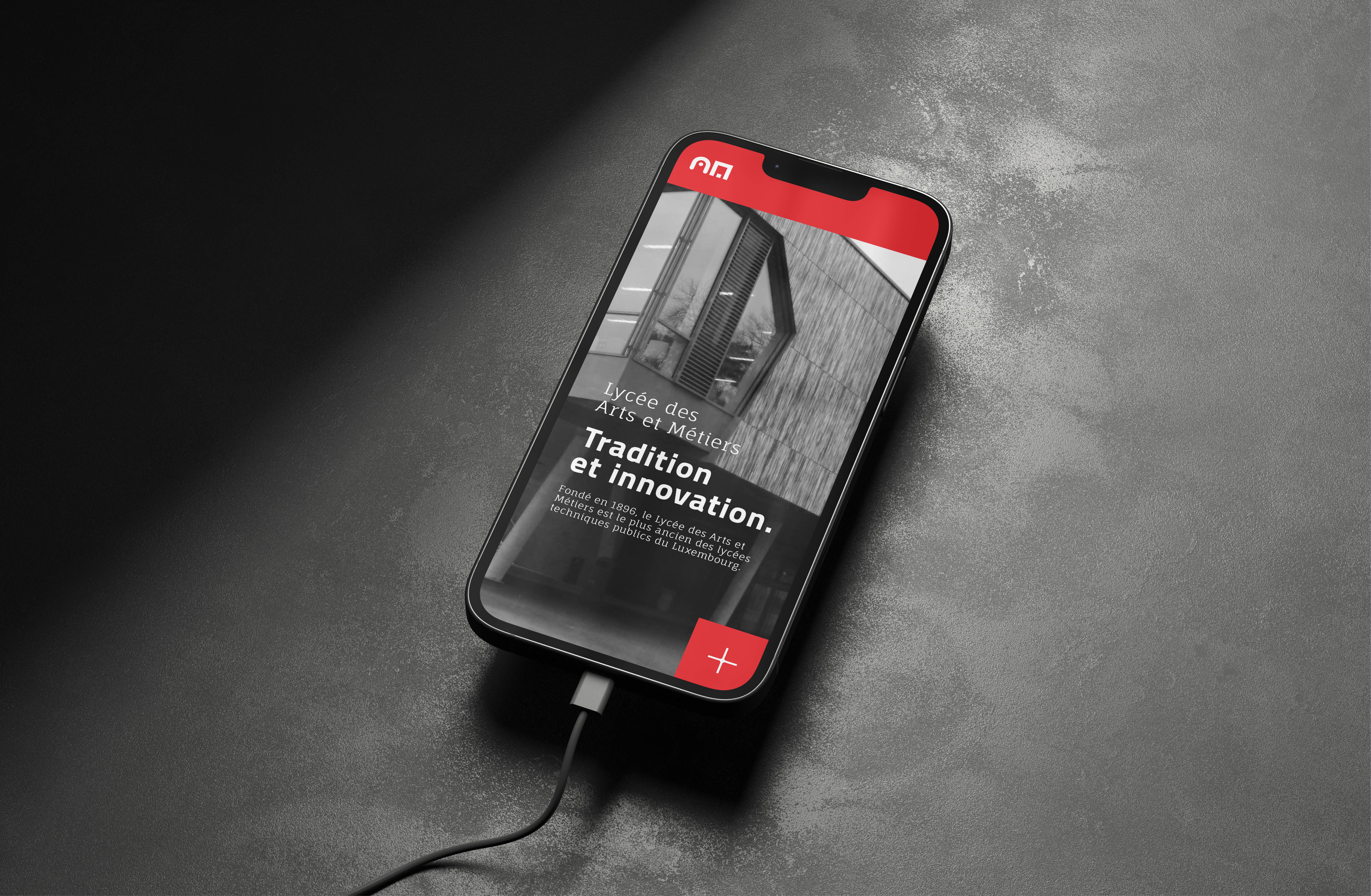
A fresh look for Luxembourg’s oldest technical high school
Lycée des Arts et Métiers had used the same logo since 1970. The school had moved on: new programmes, new ambitions, same old mark.
The challenge was to give the school an identity that reflected both sides of its character: technical precision and creative thinking.
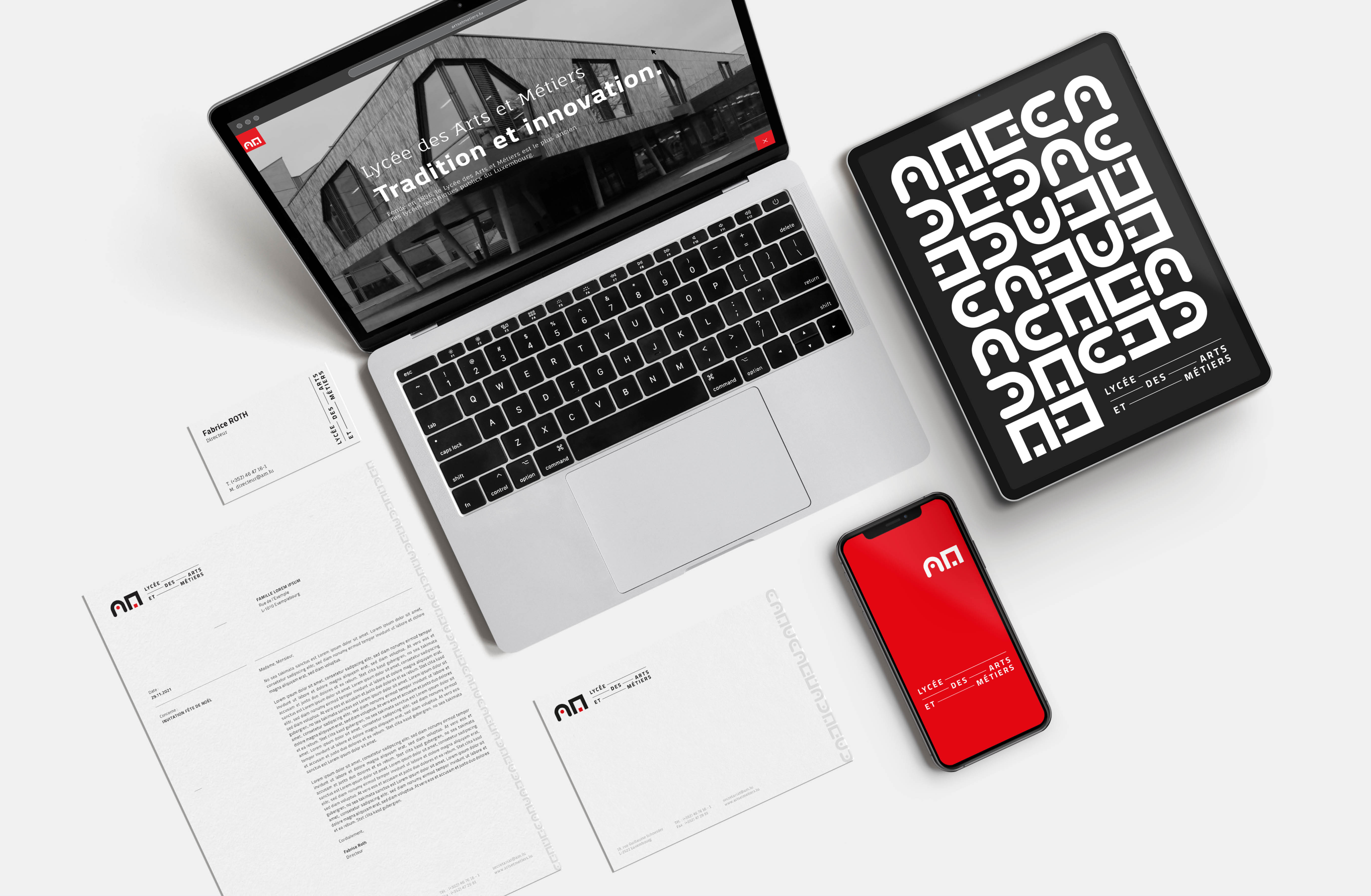
The result is a modular system built to work everywhere, from official documents and the school website to posters, signage and billboards. Expressive when it needs to be, restrained when it should be.
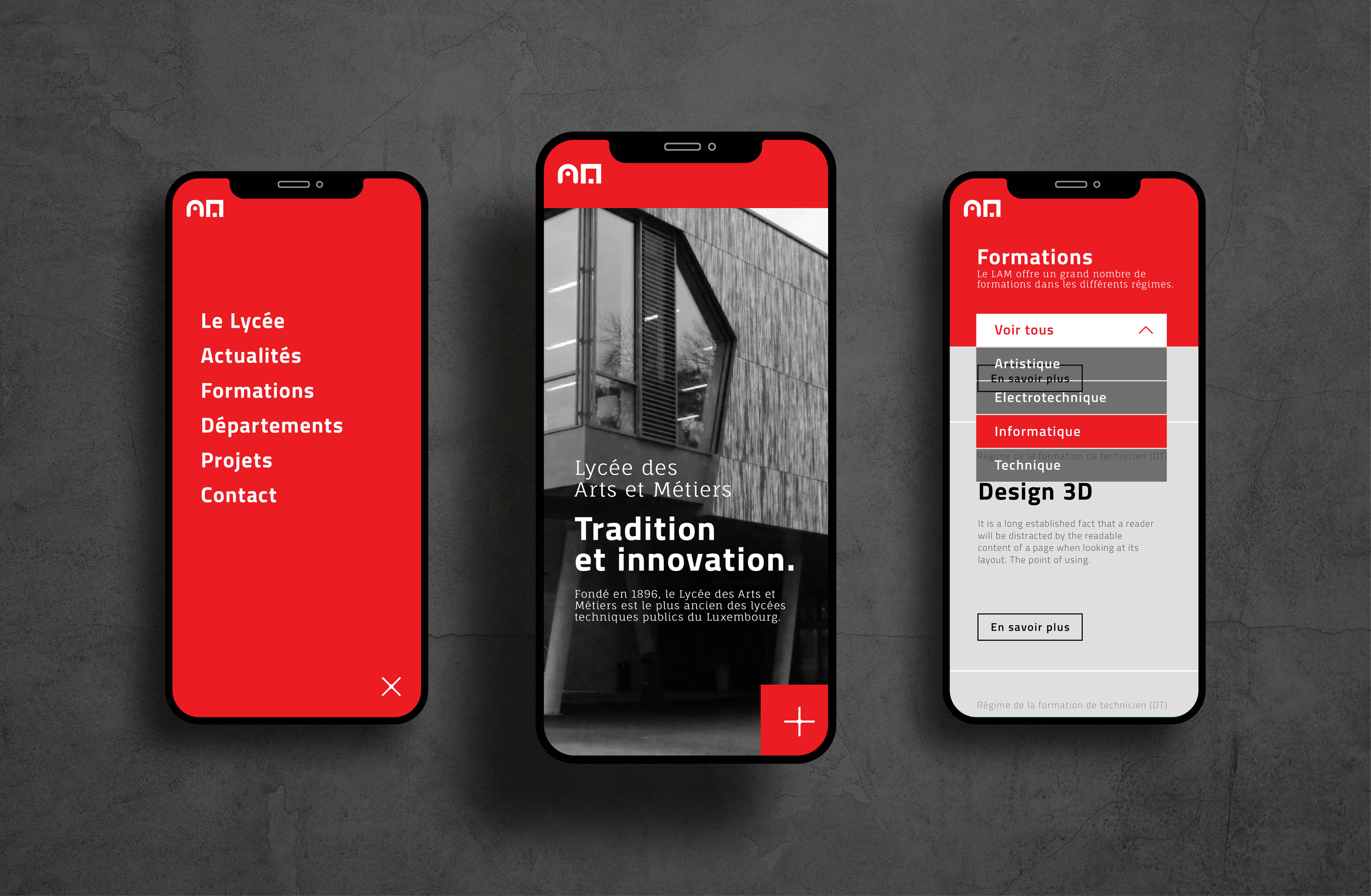
Two letters, two worlds
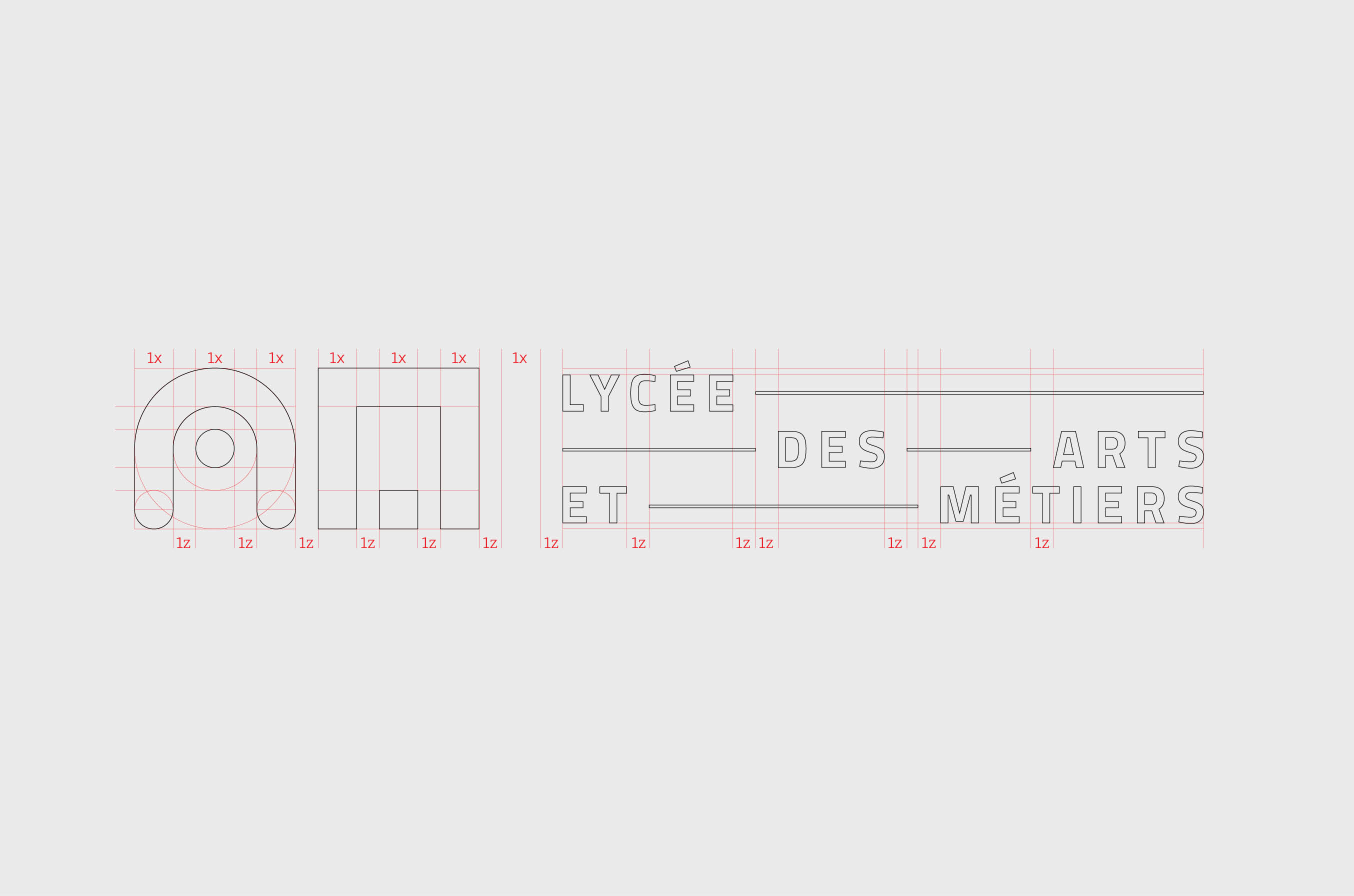
The mark reads the school’s initials as two characters: one rounded and expressive, one angular and restrained.
Together they spell AM, and the two sides of the school.
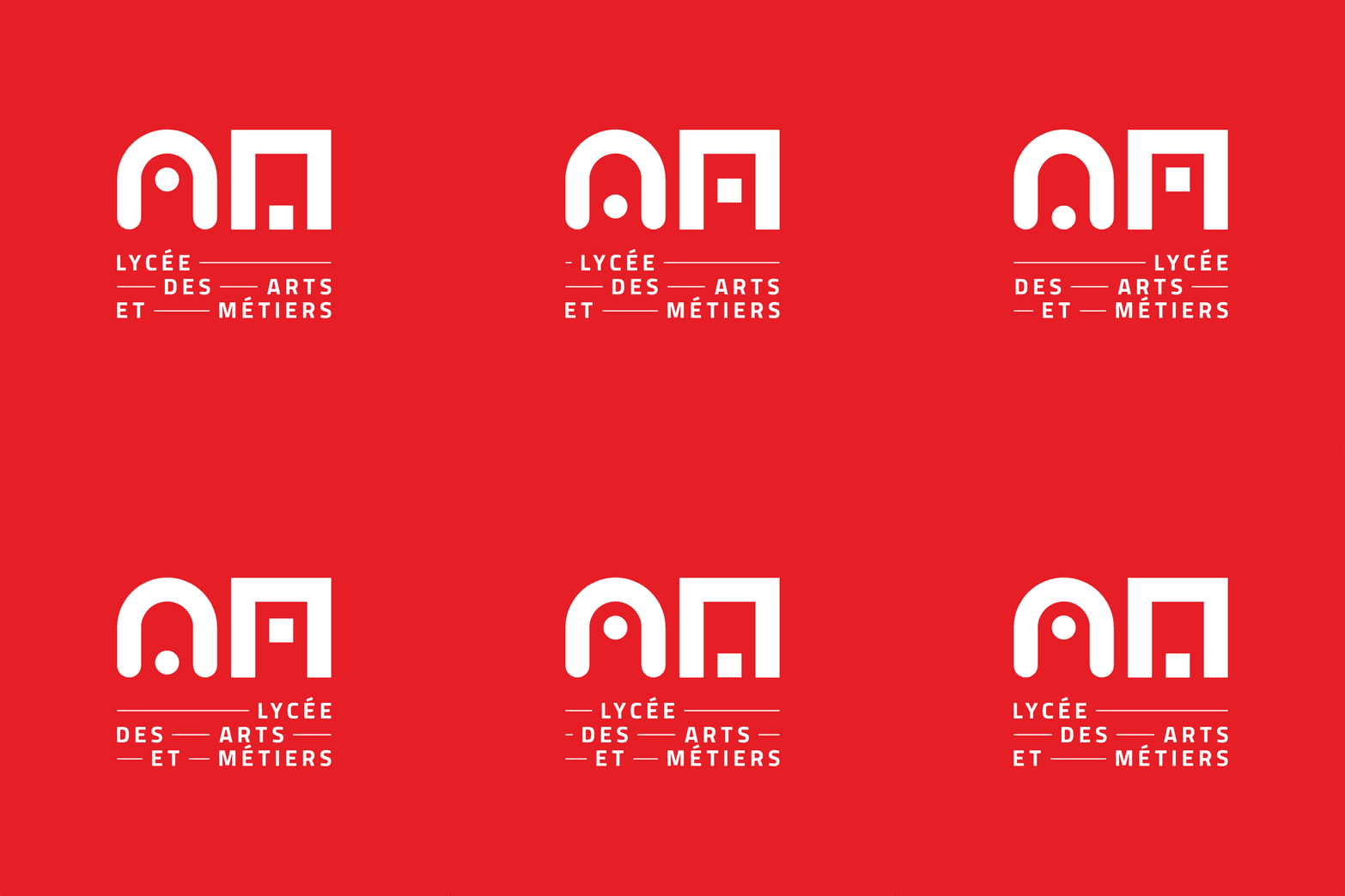
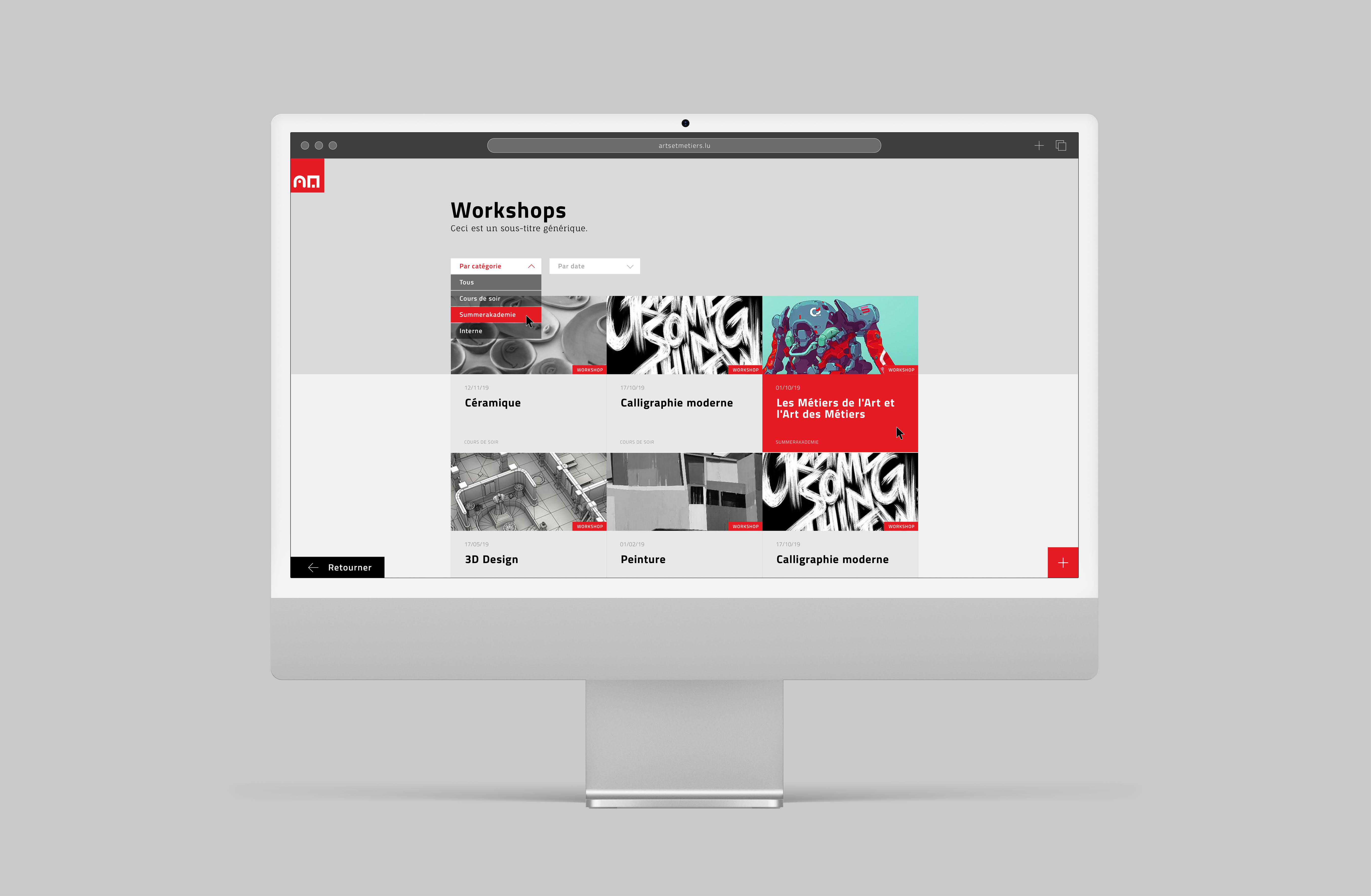
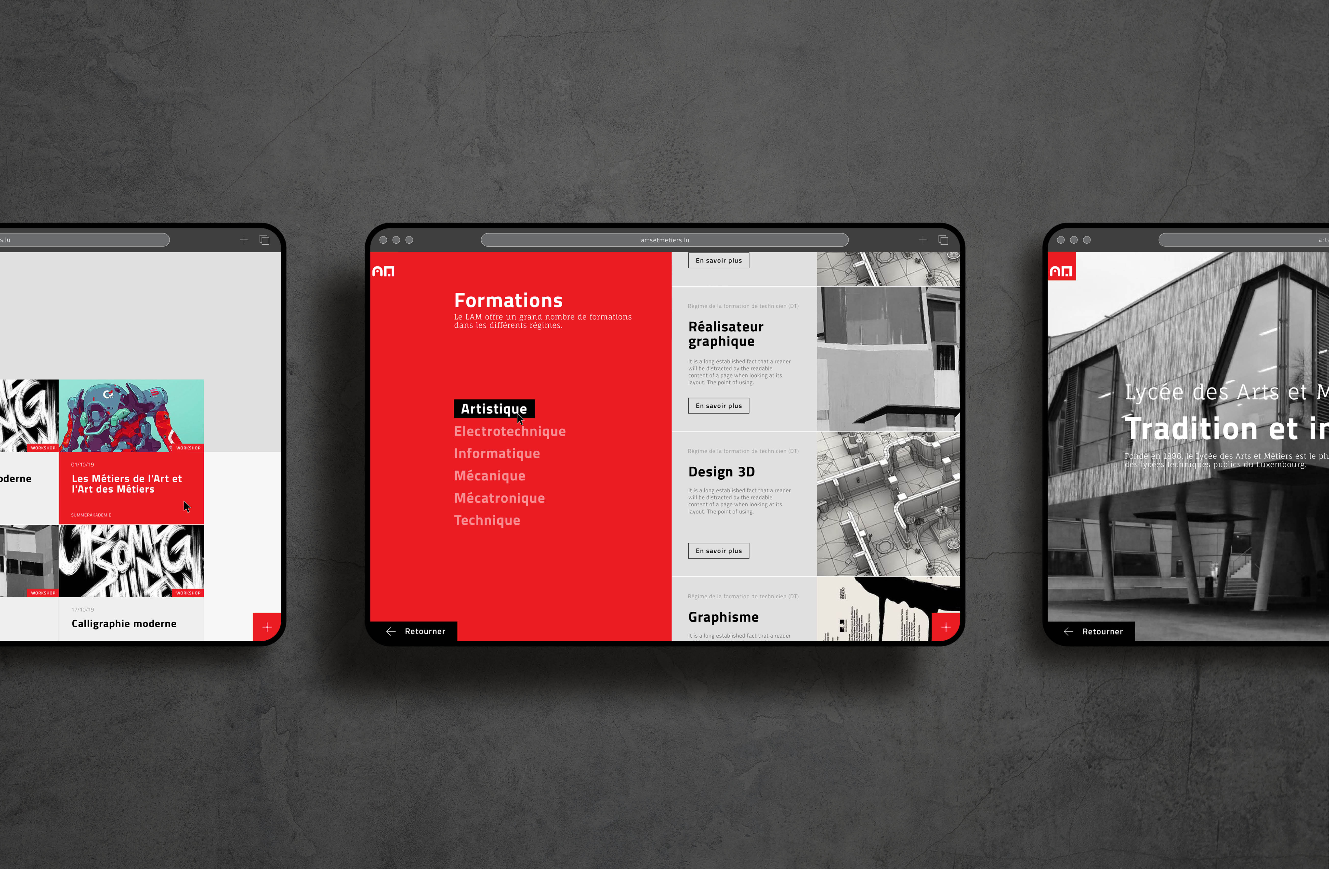
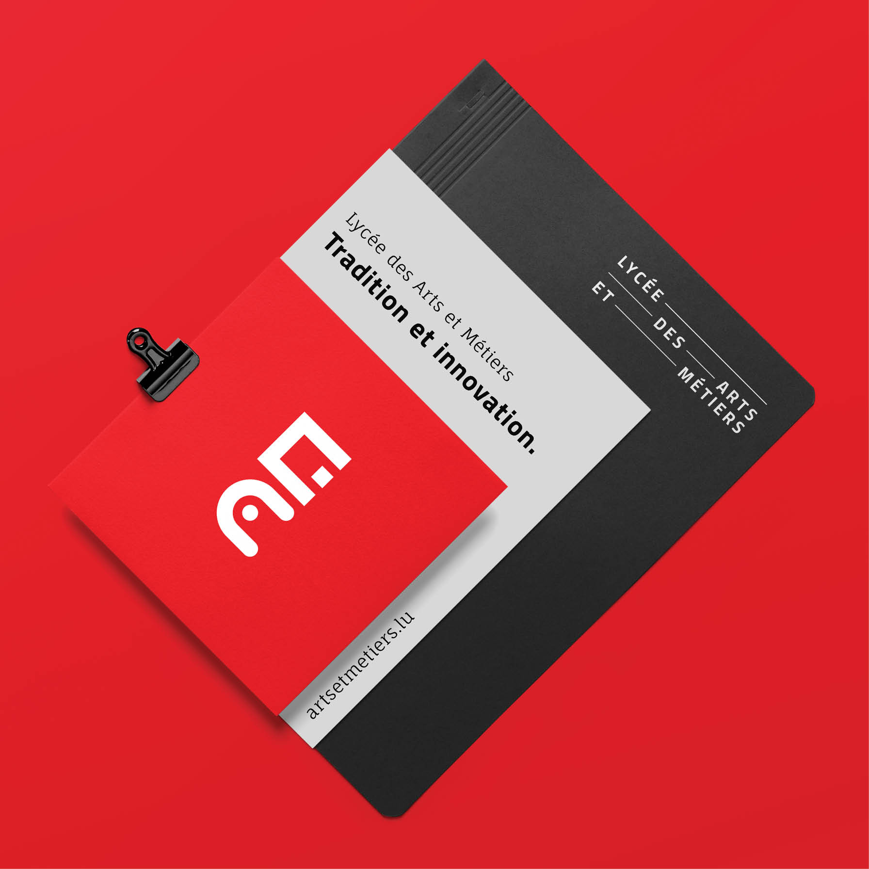
Scale, repeat, shift
In print, the logo works as a graphic element rather than a fixed stamp. It scales, repeats and shifts with the format.
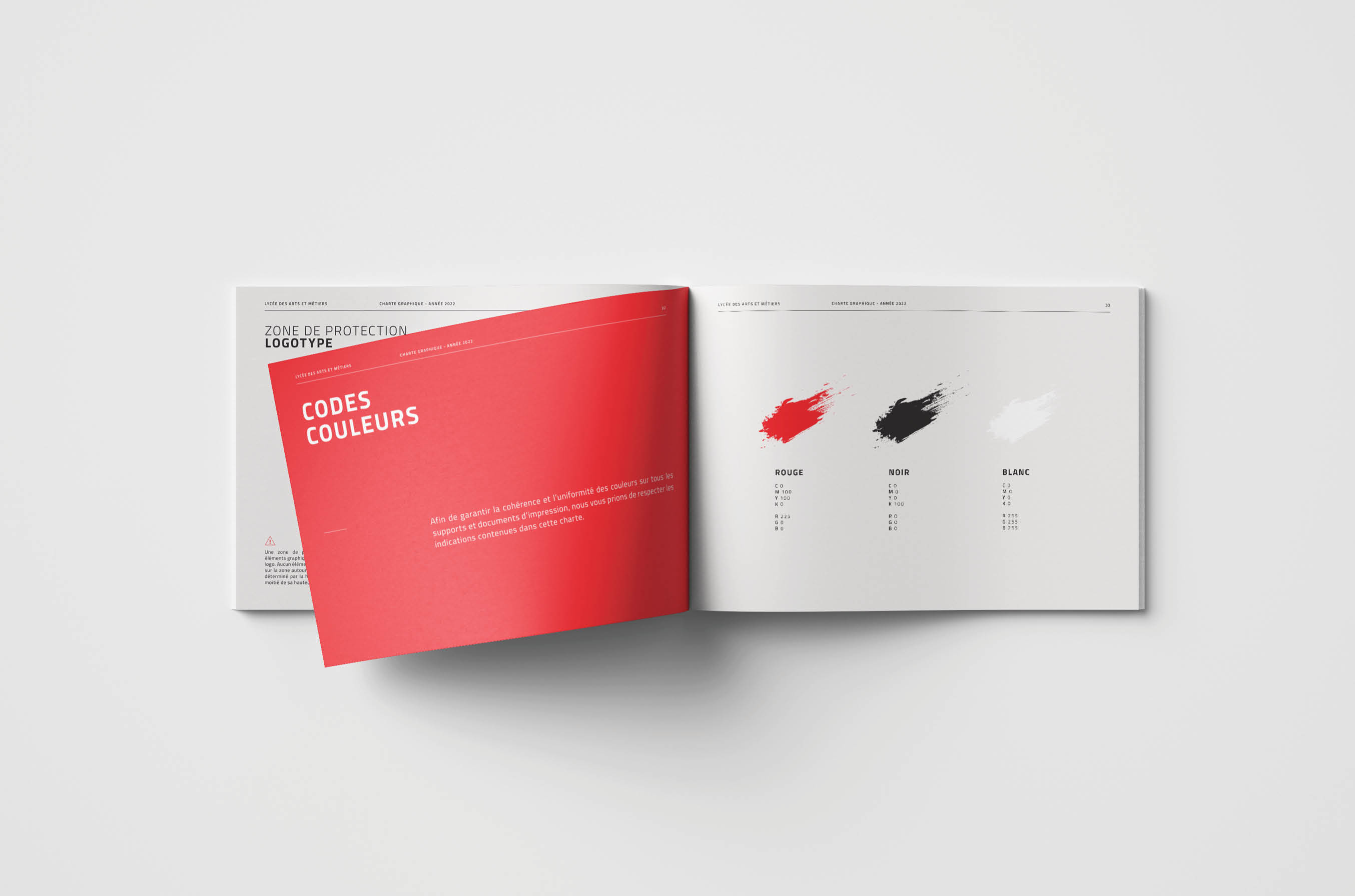
Red does the shouting. The institutional pieces stay calm and structured.
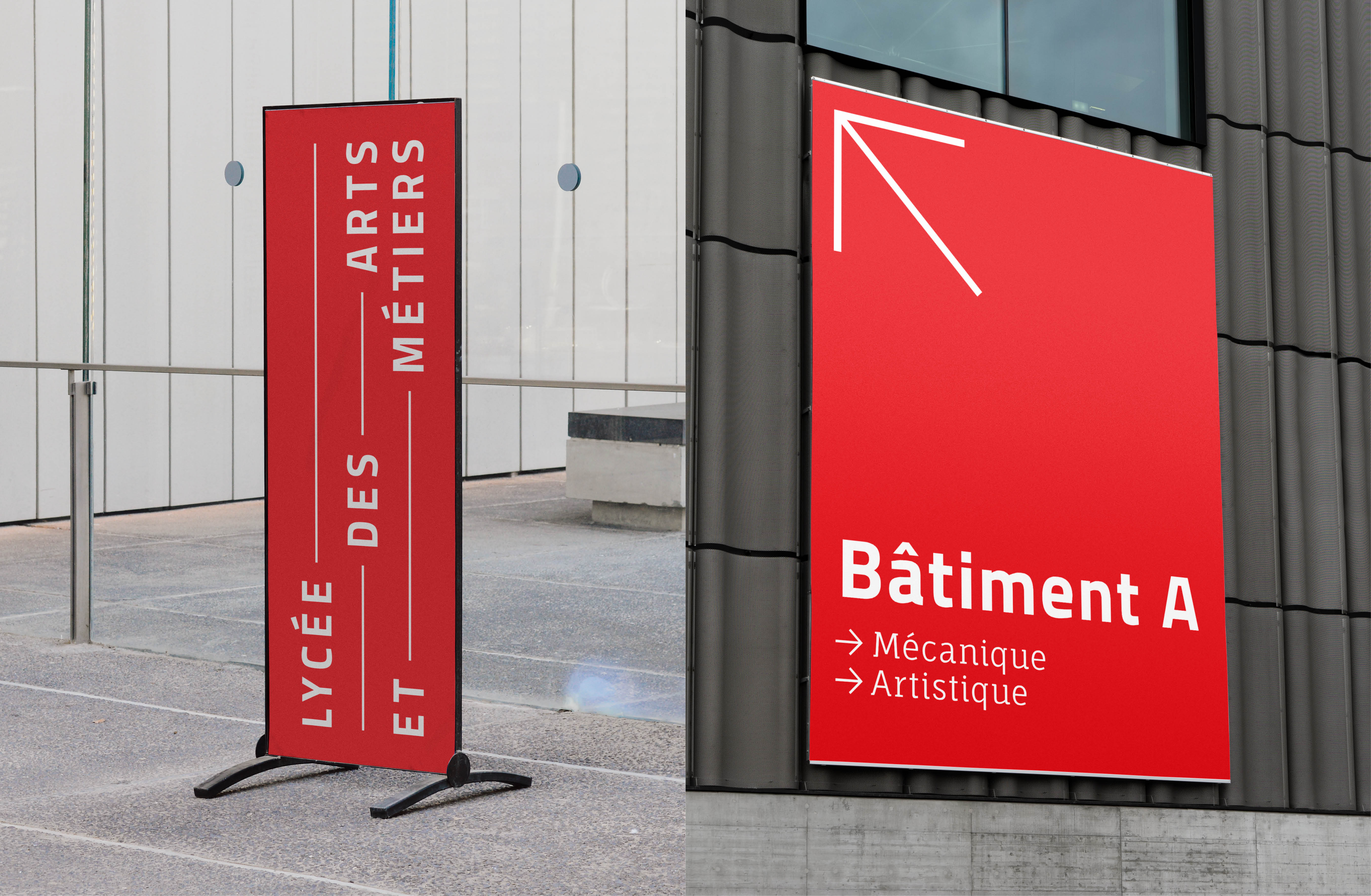
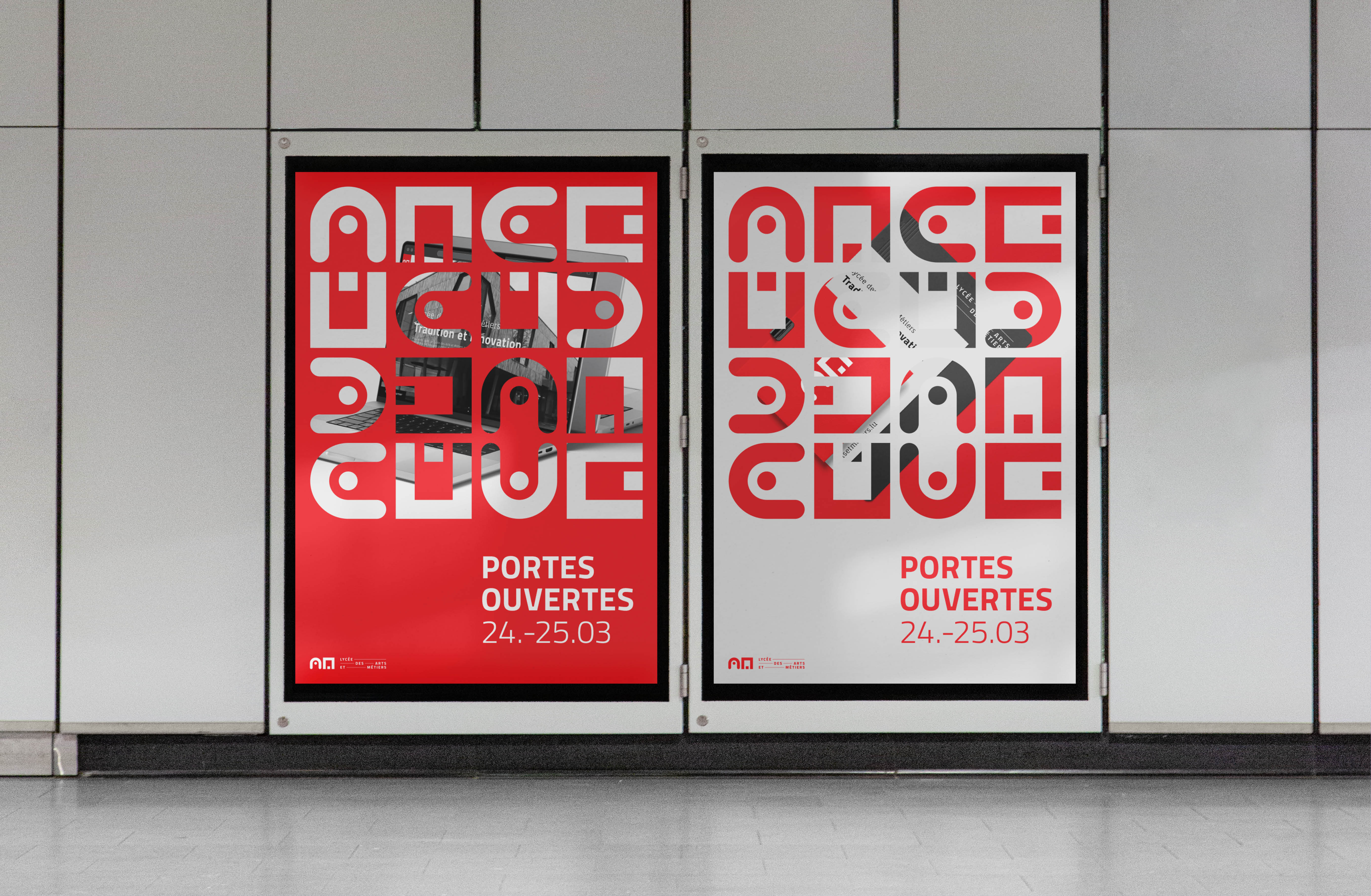
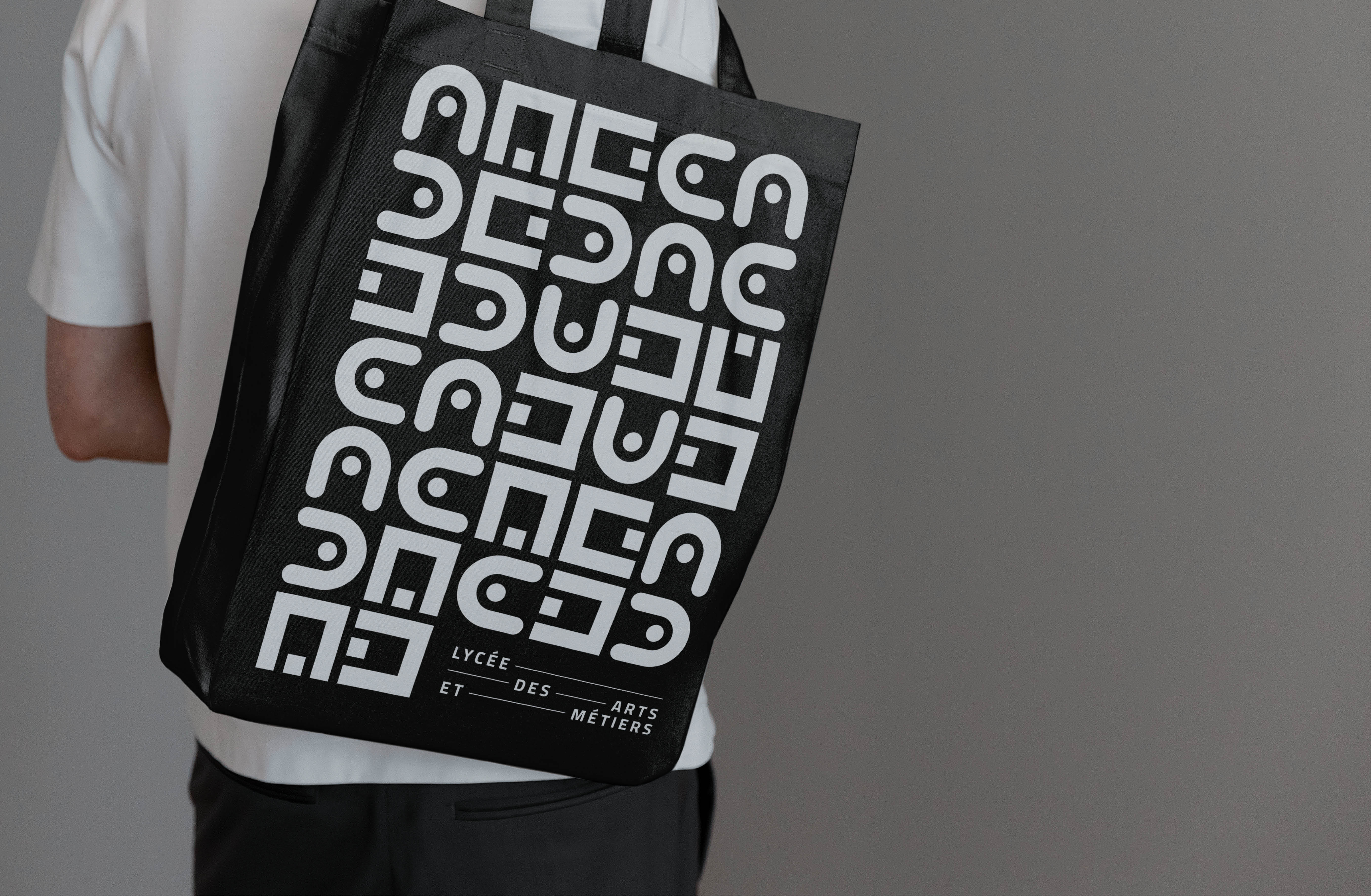
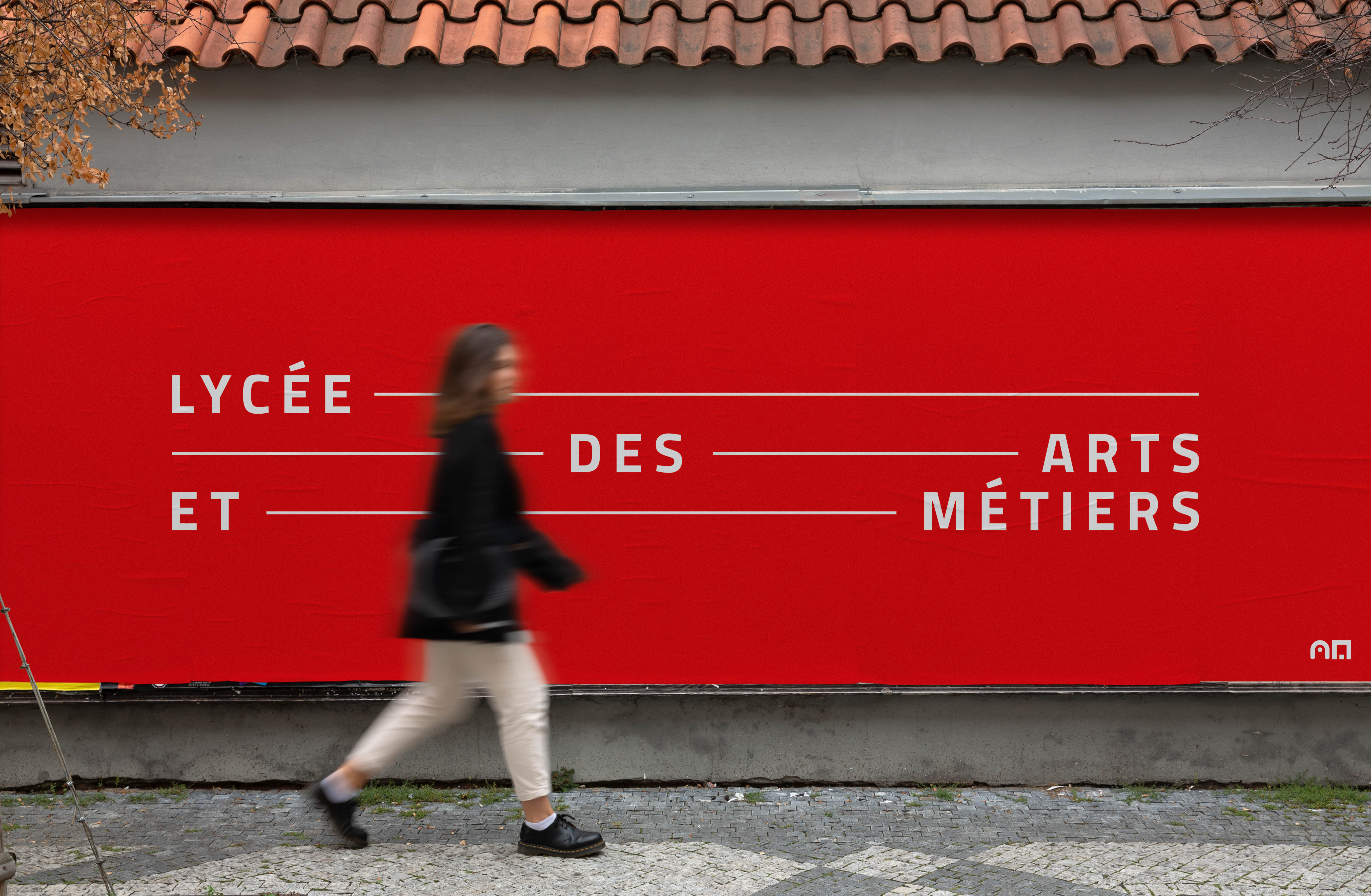
After more than 50 years with the same logo, the school has an identity as forward-looking as its programmes: technical and playful at once, from the website to the billboard.
Curious what we could create together?
Tell me what you are working on.


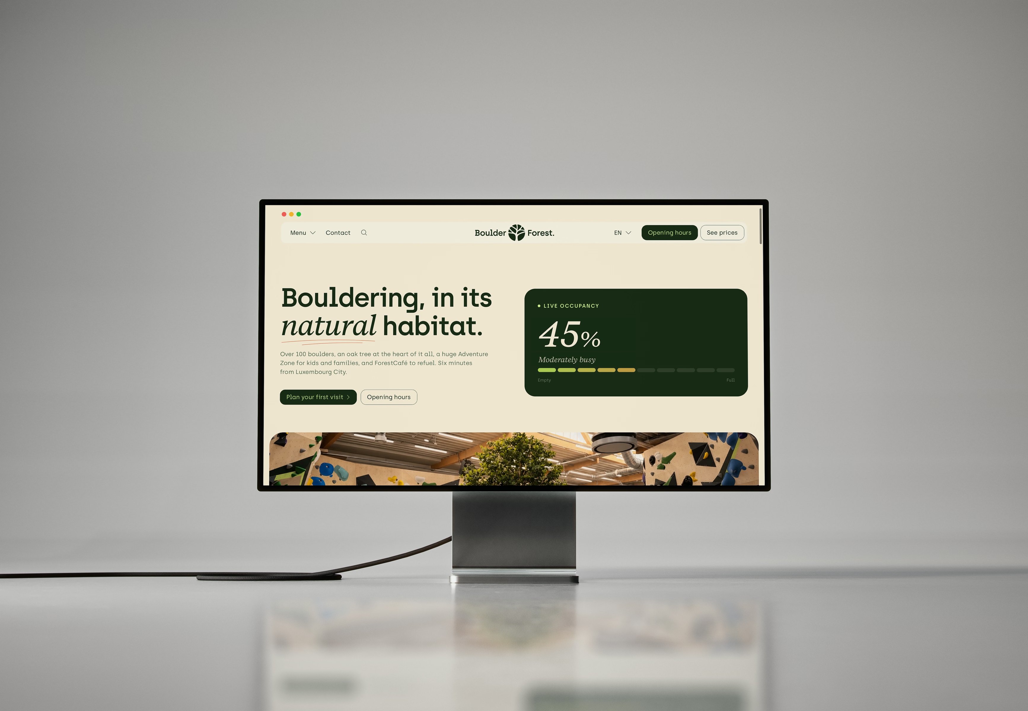

BoulderForest
Bringing the forest indoors: branding for Luxembourg’s new bouldering gym