
Beyond function: an illustration-driven climbing guide
Most climbing guides read like spreadsheets. For Berdorf, I wanted something with character: precise enough to climb by, rich enough to read. I had full creative freedom, and I used all of it.
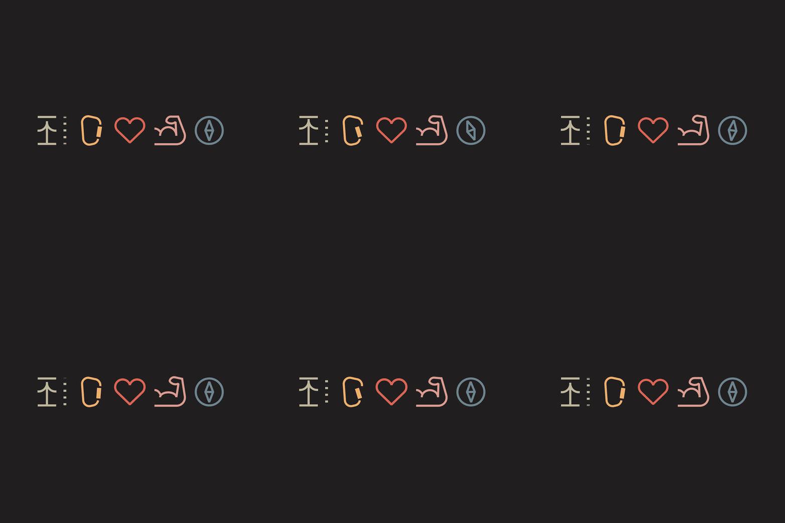
So the guide became a full visual system, with editorial layouts, a distinct illustration style, a custom icon set, and a typeface drawn just for this book.
The illustrations carry the details. There's a do's-and-don'ts spread packed with small scenes, and an illustrated interview with climbing legend Ben Moon. Throughout the book, a cast of characters reflects the climbing community. They point out hazards and local climbing rules with a wink, helping everyone enjoy the rocks while respecting the surrounding nature.



A typeface of its own
The guide speaks in its own letters. I drew the Berdorf typeface by hand and refined it digitally, so the guide has a voice before you've read a single route.


A mentor on every page
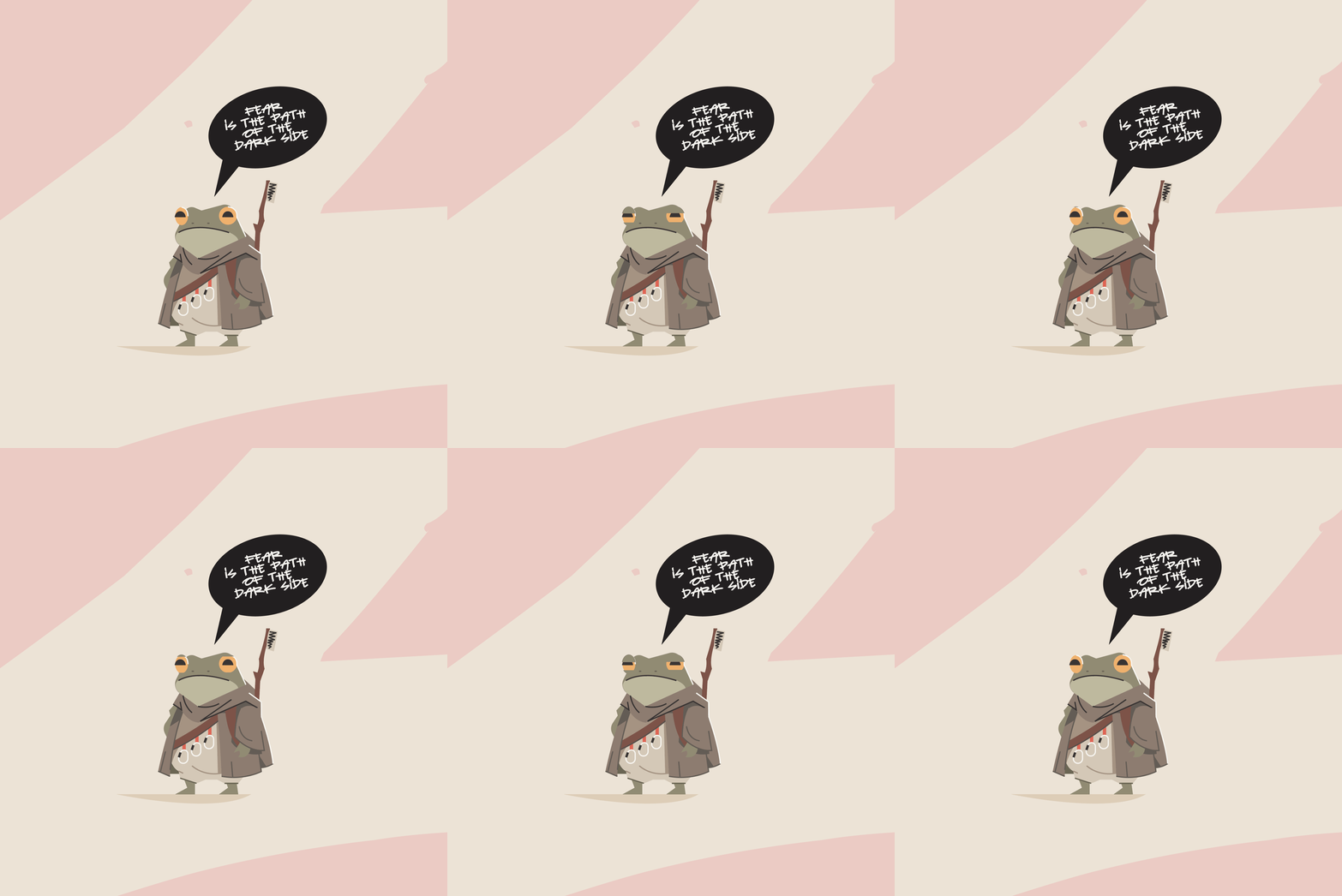
Every crag has someone who’s seen it all. In this guide it’s a frog with a staff, popping up between routes with short hints and dry observations.
A mentor who knows exactly when a bit of humour helps.


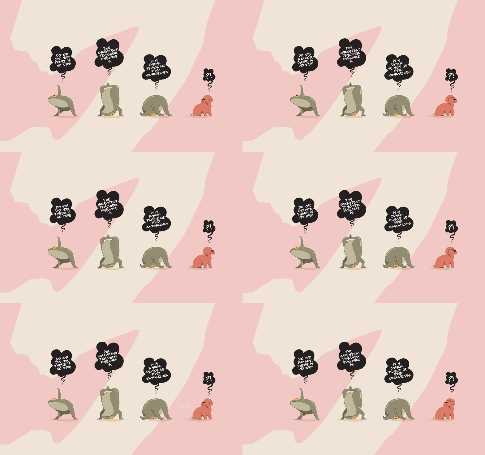
80 pages of climbing. From route pages and icons to the typeface and T-shirts, it shows that a topo can be precise and still have character. Sadly, the guide was never printed as planned.
Curious what we could create together?
Tell me what you are working on.





Let it BÄRN!
Turning Bern into a boulder topo, frame by frame